Objective
Our goal was to extend Zillow Group’s offering beyond just the search experience into the full lifecycle of a renter - from finding the perfect rental, to applying and eventually paying rent. We felt confident we could be a trusted platform for renters (and landlords) given our brand recognition in the real estate space.
Designing at scale
An interesting part of this project was the desire to build something once and have it work for multiple brands. This meant the UX design would be the same across all 3 brands but the visual design might be slightly different. Tackling a project in this way was very new for everyone involved and required many discussions around how we might be able to pull this off. In order to do this we built a new design system made up of components that could be skinned for each brand.
Visual Exploration
I got more involved in this project when Trulia wanted to do some exploratory visual design work to see what direction we could take these new products and really push into some new territory visually. Initial wireframes had already been developed by other designers for rental applications and payments so we selected a set of screens to explore. After a couple workshops and shareouts, we narrowed in on one direction that we developed further as we moved into the visual design phase of the projects.
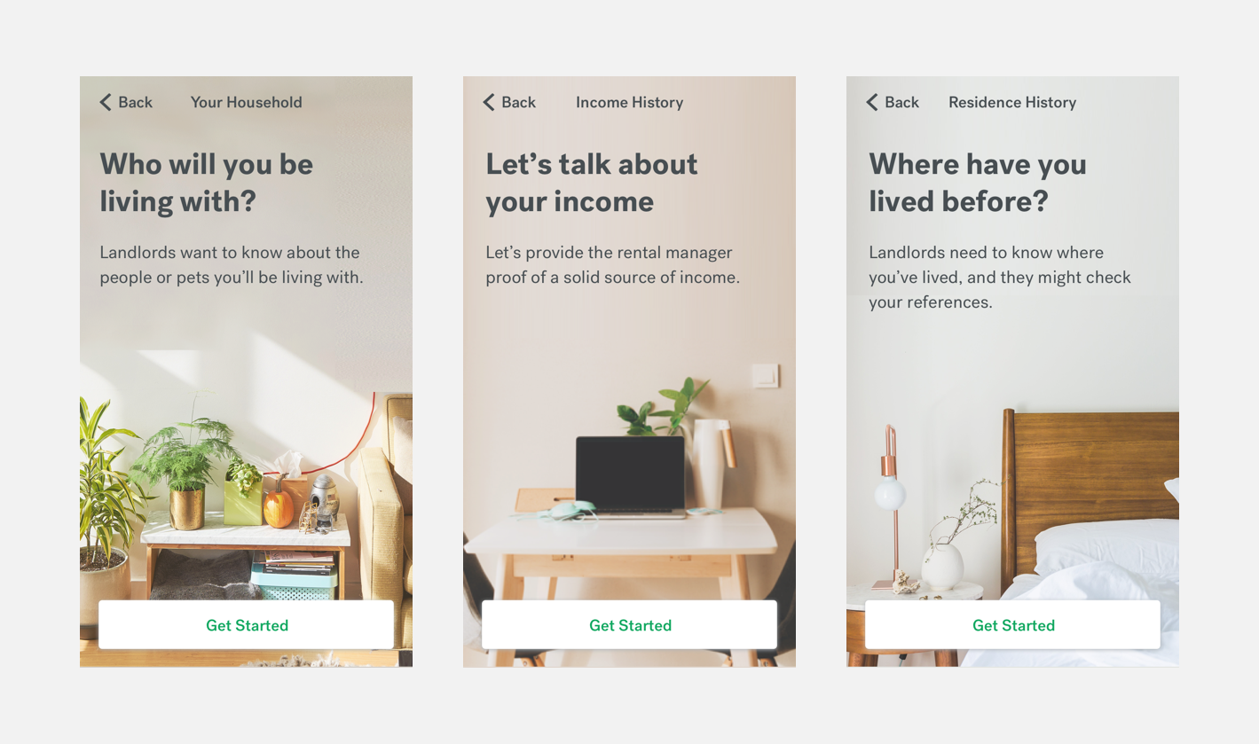
Start Screen Explorations for Rental Application Onboarding

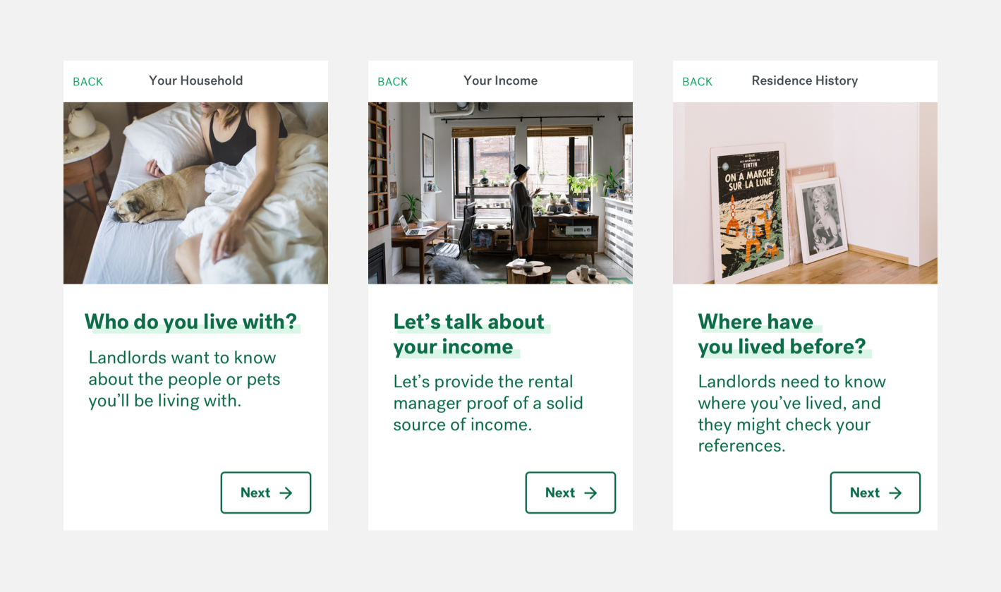
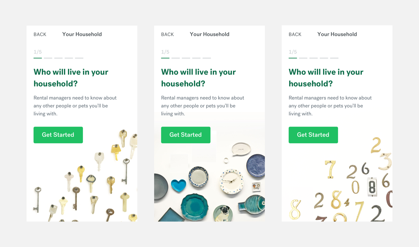
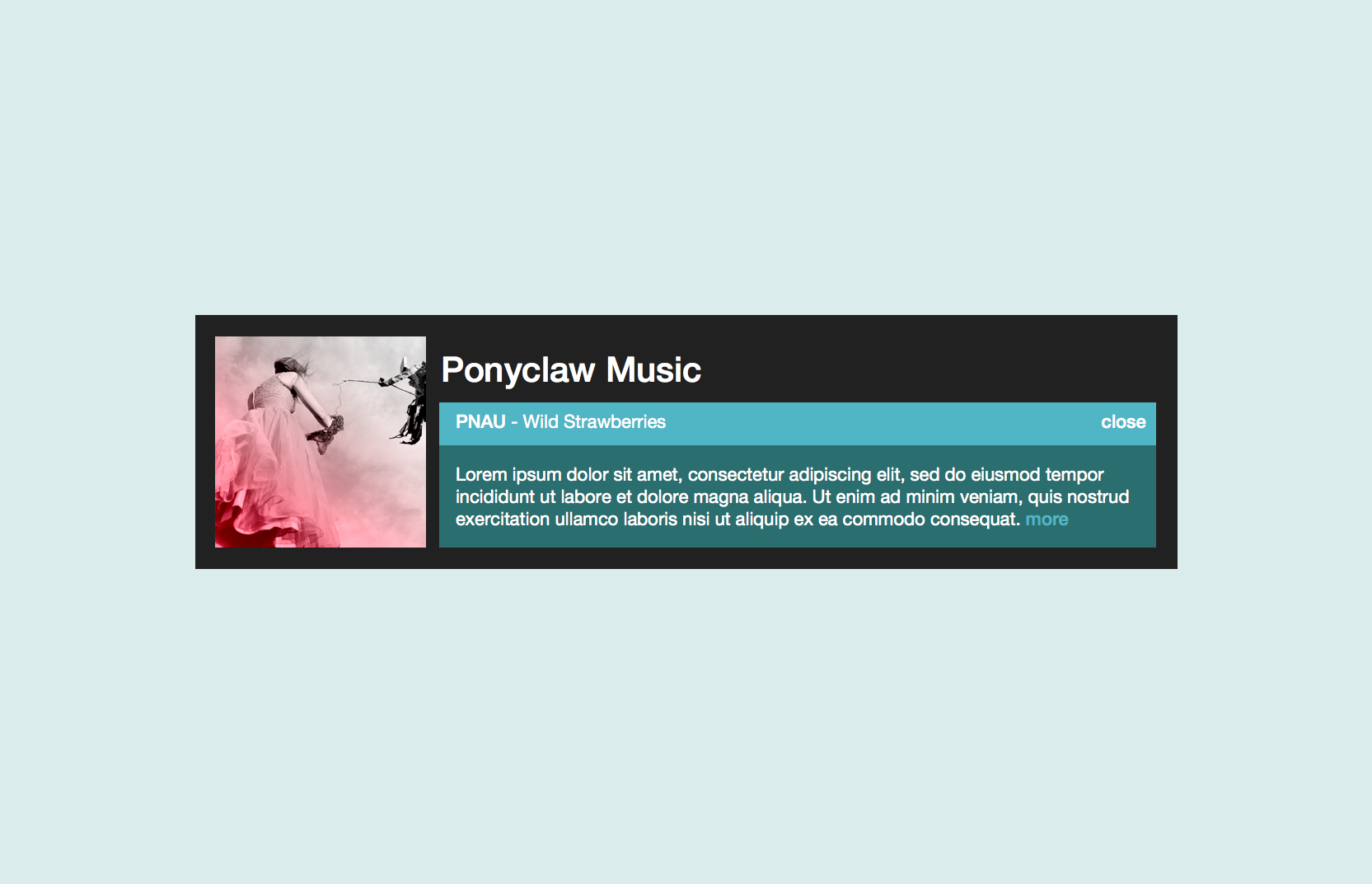
Multiple Screen Visual Explorations

Defining the MVP
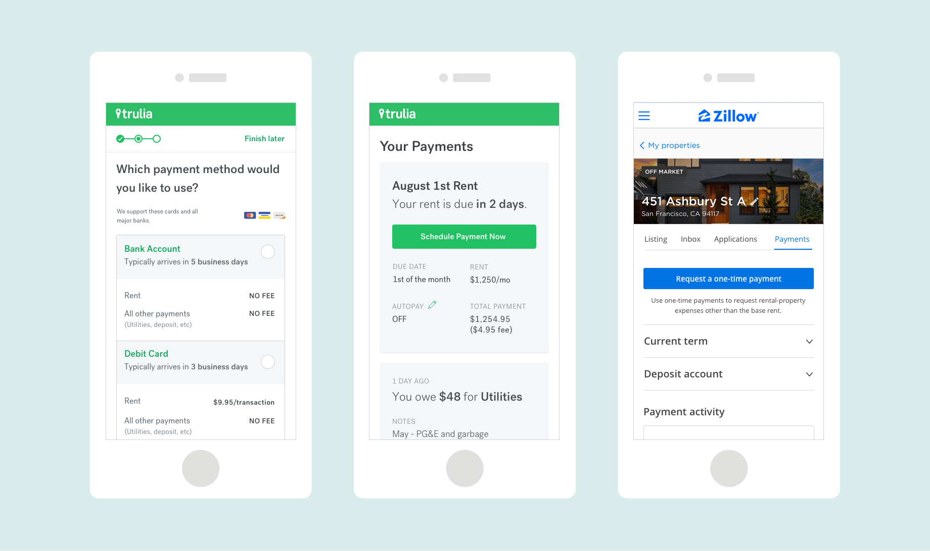
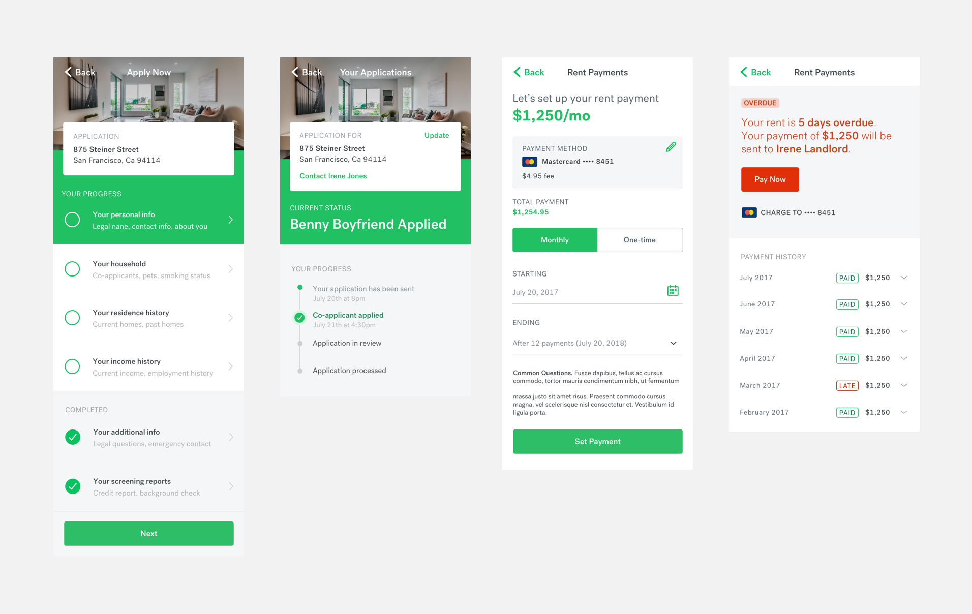
When I joined the Rent Payments team, designs has been developed to allow landlords to set up and start receiving payments for their property. This would notify the renter to start their payment onboarding and complete the payment setup process.
Upon joining the project, I found that we had one designer dedicated to enhancing the landlord experience, and another focused on optimizing the renter journey. As part of my role, I took over the design responsibilities for the renter side, eventually encompassing both sides upon the project's launch.
Collaborating closely with Trulia's engineers, we embarked on a strategic approach. We initiated the development of lightweight components based on the initial designs, enabling the foundational work to commence in parallel with our ongoing design refinement for the MVP.
Expanding upon the initial concepts, I crafted additional states and use cases, while also applying the finishing touches to the visual design. The journey towards building and preparing the MVP for launch was a collective effort that demanded the engagement of every team member. This involved extensive collaboration with engineers, as we worked together to ensure the seamless realization of our design vision.
Renter Onboarding Prototype (WIP)
*note this is a basic prototype given it was made in Sketch and I’ve hooked up screenshots*
Post-Launch
After we launched our beta we continued to add features that we knew were needed for the product to be successful. We tested and monitored our beta as we continued to roll it out to a larger audience.
We overhauled our onboarding experiences for both the landlord and renter after testing the MVP and realizing there were obvious improvements we could make.
There are many more insights and learnings on this project that I’d be happy to share!
MAY 2018
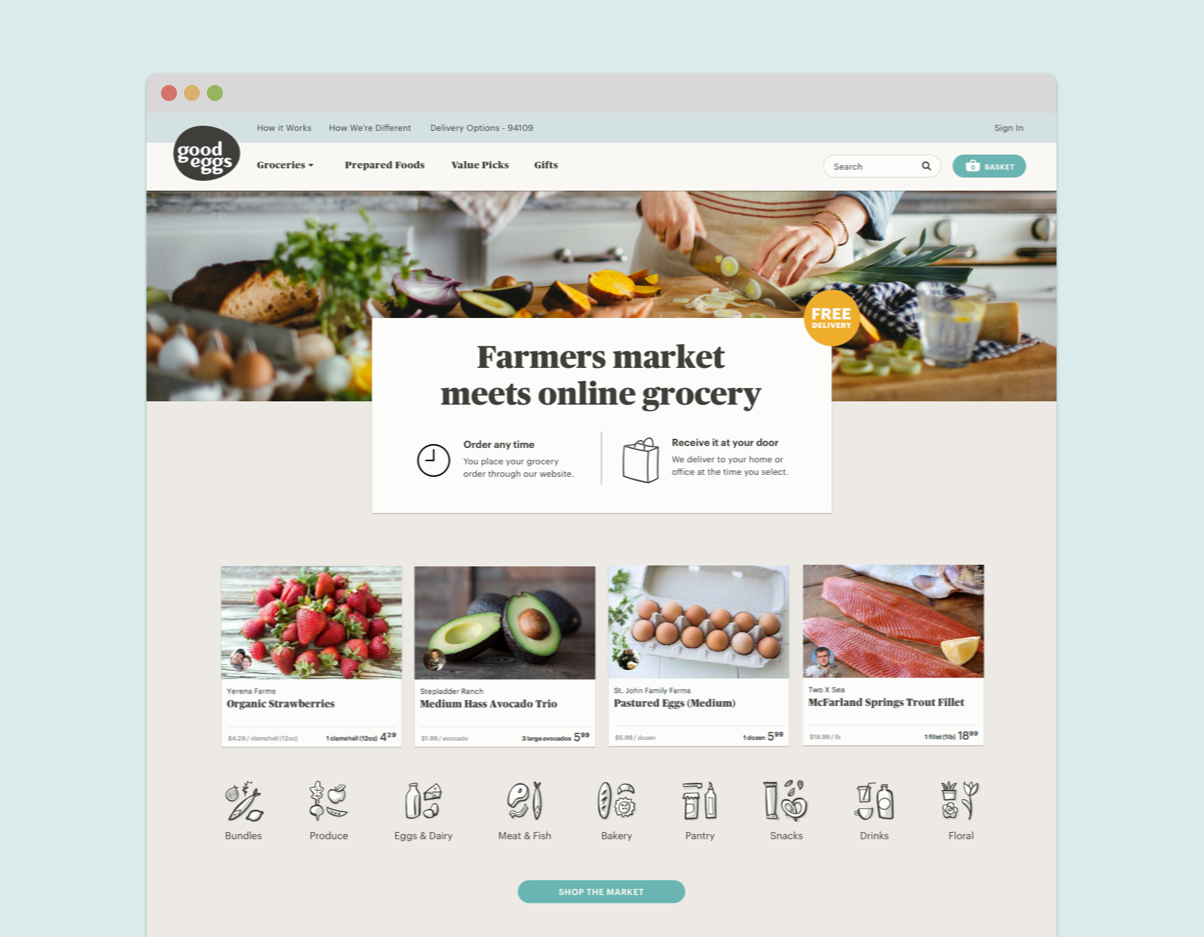
Going into our second quarter of 2015, Good Eggs formed teams around several initiatives one of which was new customer acquisition. The acquisition team (aka team Welcome Wagon) consisted of myself as lead designer with a supporting designer, a lead engineer and 2 additional engineers as well as a marketing stakeholder who was also acting as the PM. We knew that the Good Eggs model was hard to understand and we wanted to really be thoughtful and deliberate around the first time customer experience which hadn’t gotten much love in the past.
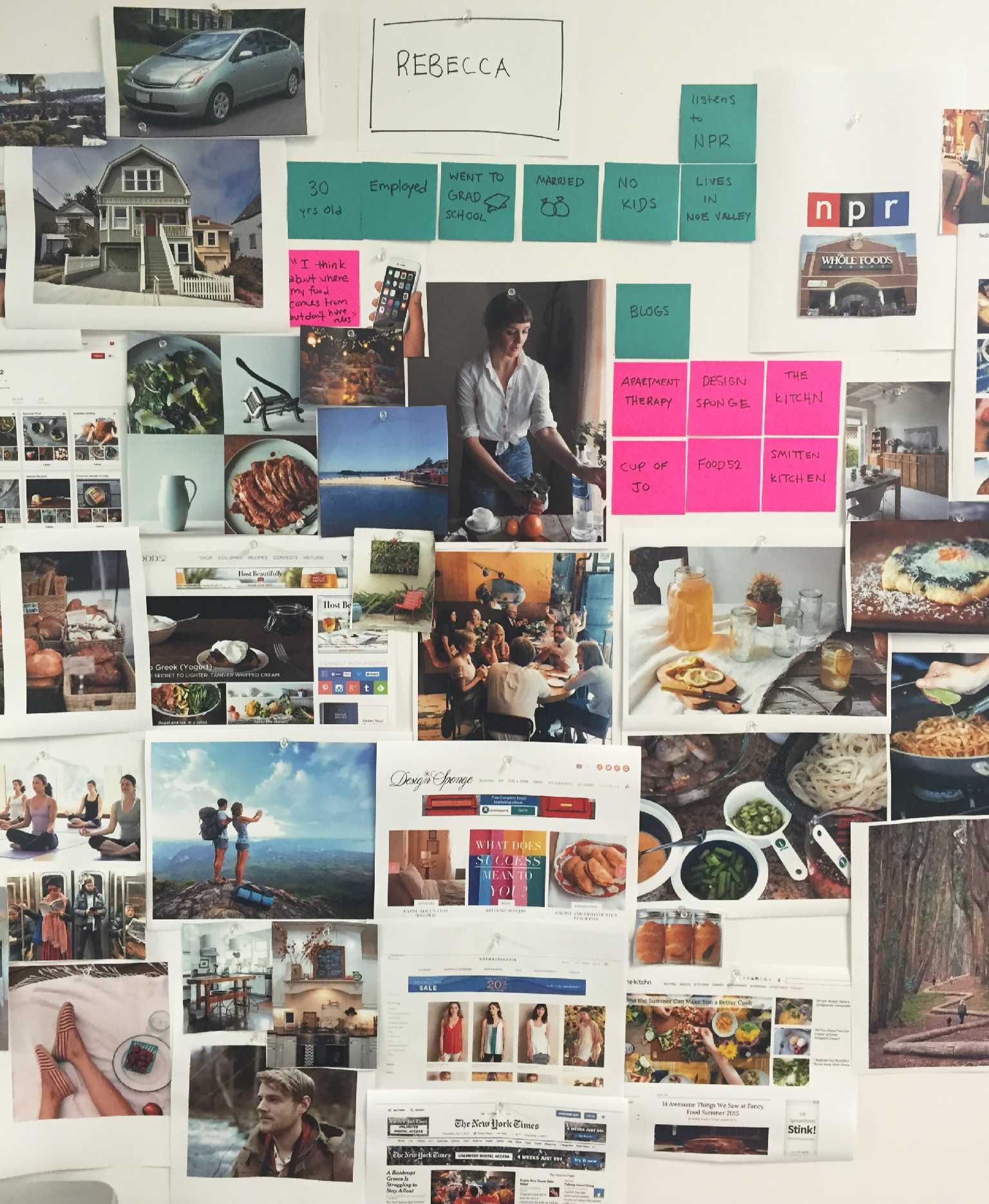
To start things off we had the PM pull numbers around some of our new customer metrics and as a team, we got together to discuss which projects might have the biggest impact. Several projects surfaced and were prioritized. Our first week in, we started by doing user testing of our current site experience to see where we saw obvious opportunities to improve messaging of what Good Eggs is. We did some competitive analysis and also met with customer care to understand what questions they hear most often from customers. Based on this research, myself and another designer started to brainstorm on better ways to explain our service.
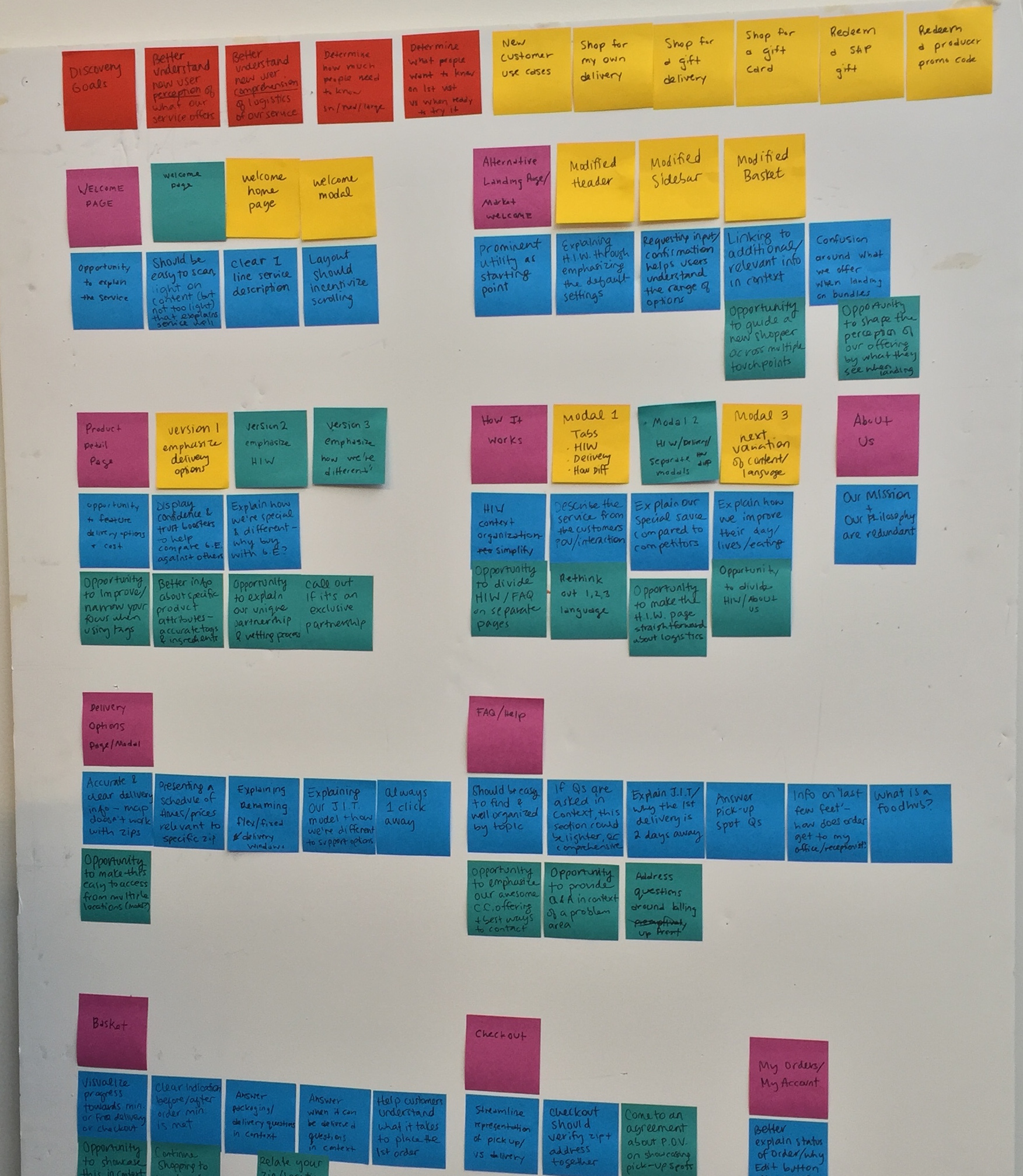

We came up with a few new concepts and did another round of user testing which resulted in a huge improvement on comprehension and understanding of how Good Eggs worked. Our goal was to answer the common questions like, “Do you deliver to me? Is there an order minimum? Do I need to be home to receive my groceries?” A couple concepts that we felt we could pursue were introducing a set of modals accessible from the top nav that would explain how Good Eggs worked. We also wanted to be thoughtful about where a 1st time customer landed and tried out a 1st time customer homepage which doesn’t currently exist in the experience. We felt it could be disorienting to land in a market page without really understanding what Good Eggs was about and what you could do here. A homepage could tell more of a story at a glance.
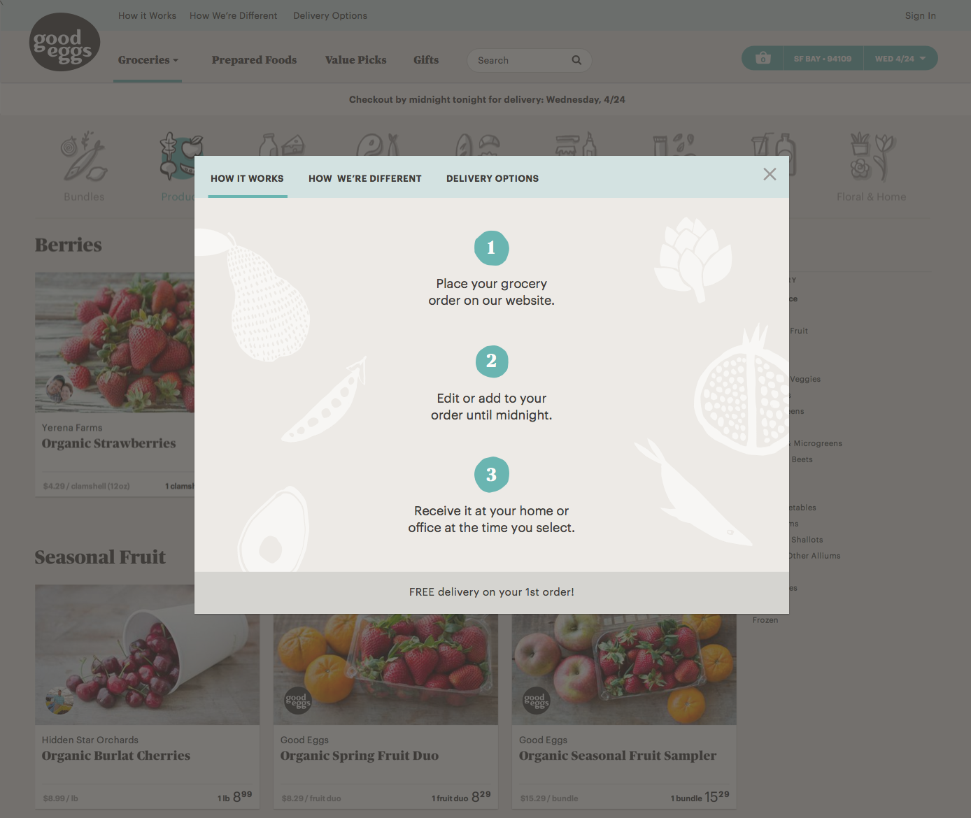
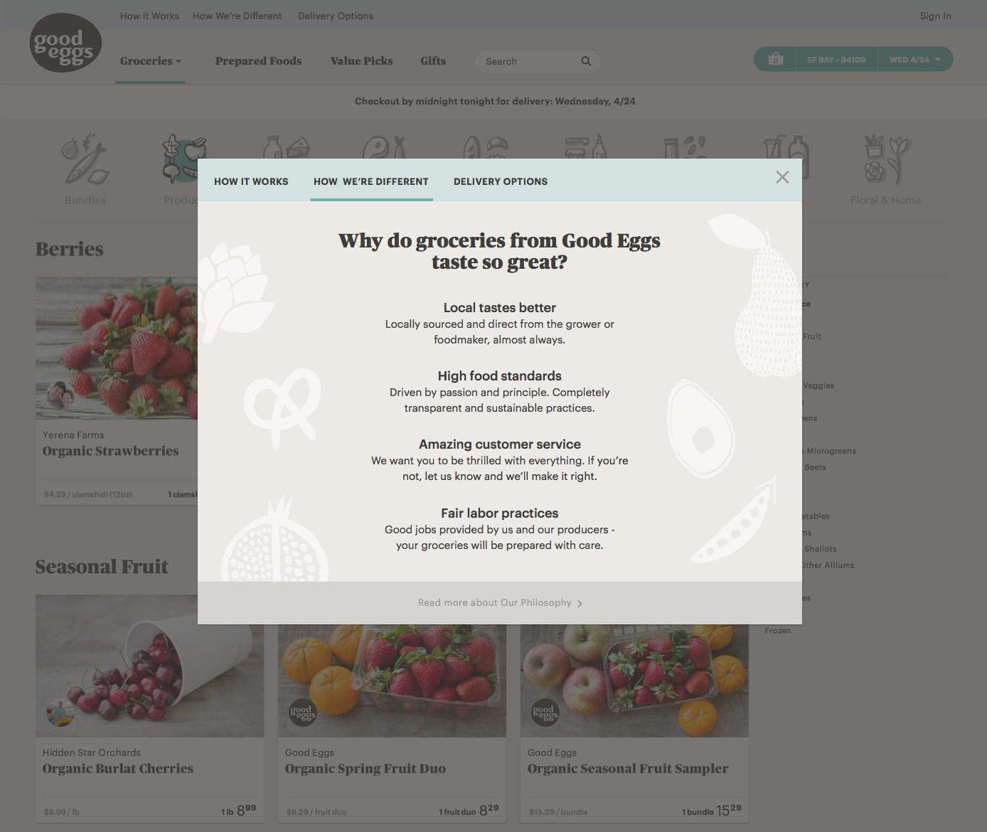
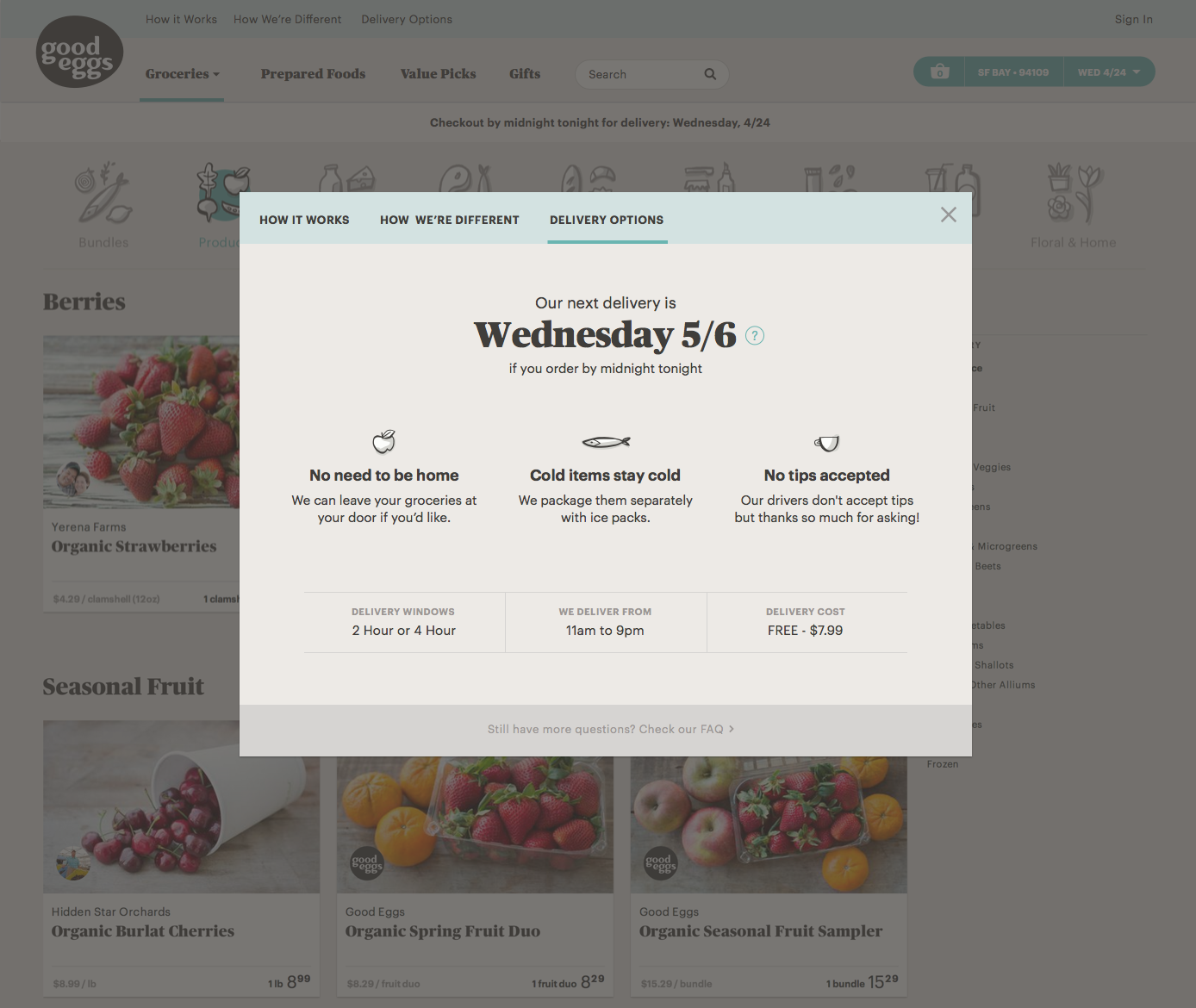
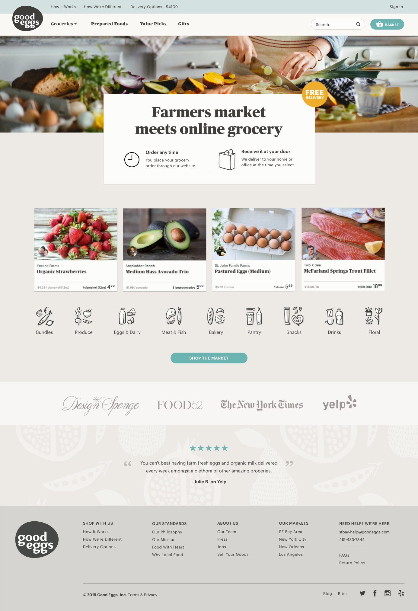
After user testing, we did a few more iterations on the modal designs both in terms of layout/hierarchy and visual design before starting implementation. After launch, we learned that customers that interacted with any of the modals were 7 times more likely to make a purchase.
Next up we focused on improving the basket page if someone visited and hadn’t added any items yet. It was pretty bare bones with a text link to shop and surprisingly a lot of new visitors were ending up there. We wanted to make it very apparent that they hadn’t added any products yet and possibly provide messaging around how Good Eggs works along with showing cross-sells. This initiative felt like a quick win overall and it was possible users were going here to get answers to how the service worked.
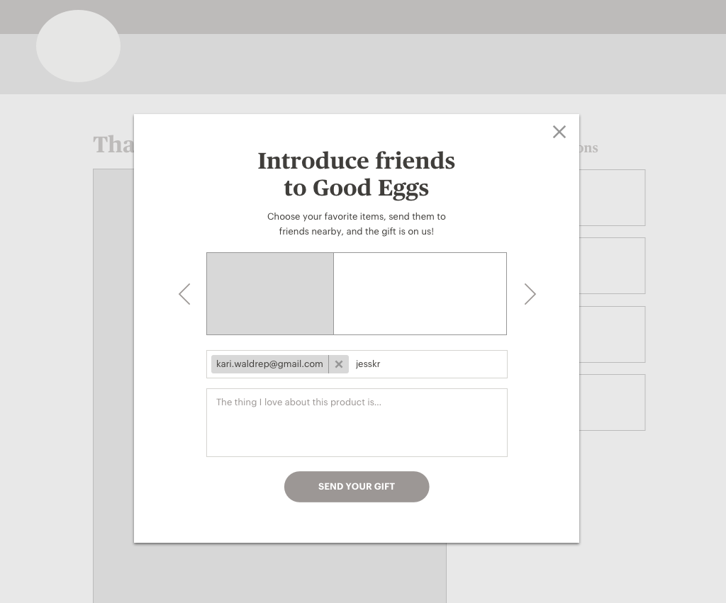
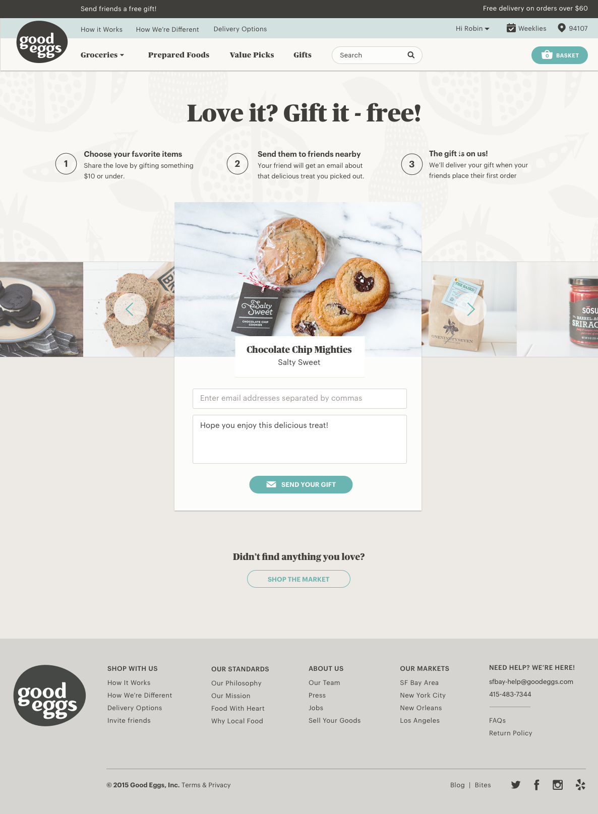
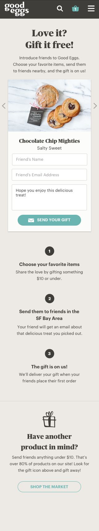
Good Eggs had launched a referral program about a year ago in which registered users can gift products under $10 for free to new users when they place their 1st order. This program was not something most customers were aware of because products could only be gifted from the product detail page and a promotional email that is sent to soon after their 3rd order was placed. Ultimately this program lacked awareness and there wasn’t a home for this program to explain how it worked. This initiative felt important because most new visitors that were gifted a product from a friend were very likely to place an order.
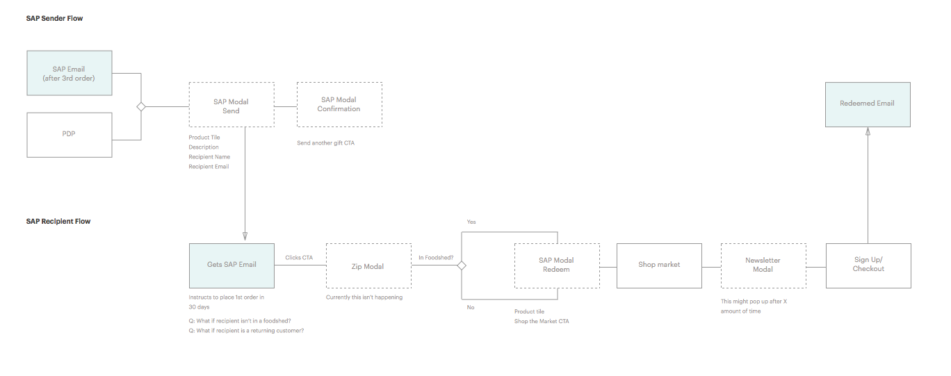
After some initial design exploration we decided a landing page would provide marketing with a destination to link to as well as better explain how the program worked. We had other ideas like allowing for gifting after placing an order or linking to a category page filtered by giftable items but given our week timeframe we decided to start with the landing page and going from there.


Team welcome wagon did a lot in regards to the new customer experience and I'm proud of the work we achieved in such a short amount of time!
APRIL 2015
Objective
Our in-house research team has conducted many sessions around the theme of community and identity. Based on this research it was apparent that our customers wanted to connect with others like her. For example, as a 6 ft tall lady myself, I’m always on the hunt for other tall ladies to see how ModCloth items fit them to assess if they’d work for me. We recognized that if we focused on this theme of user identity, we could increase awareness of products via people which could be a very powerful thing.
Initial Exploration
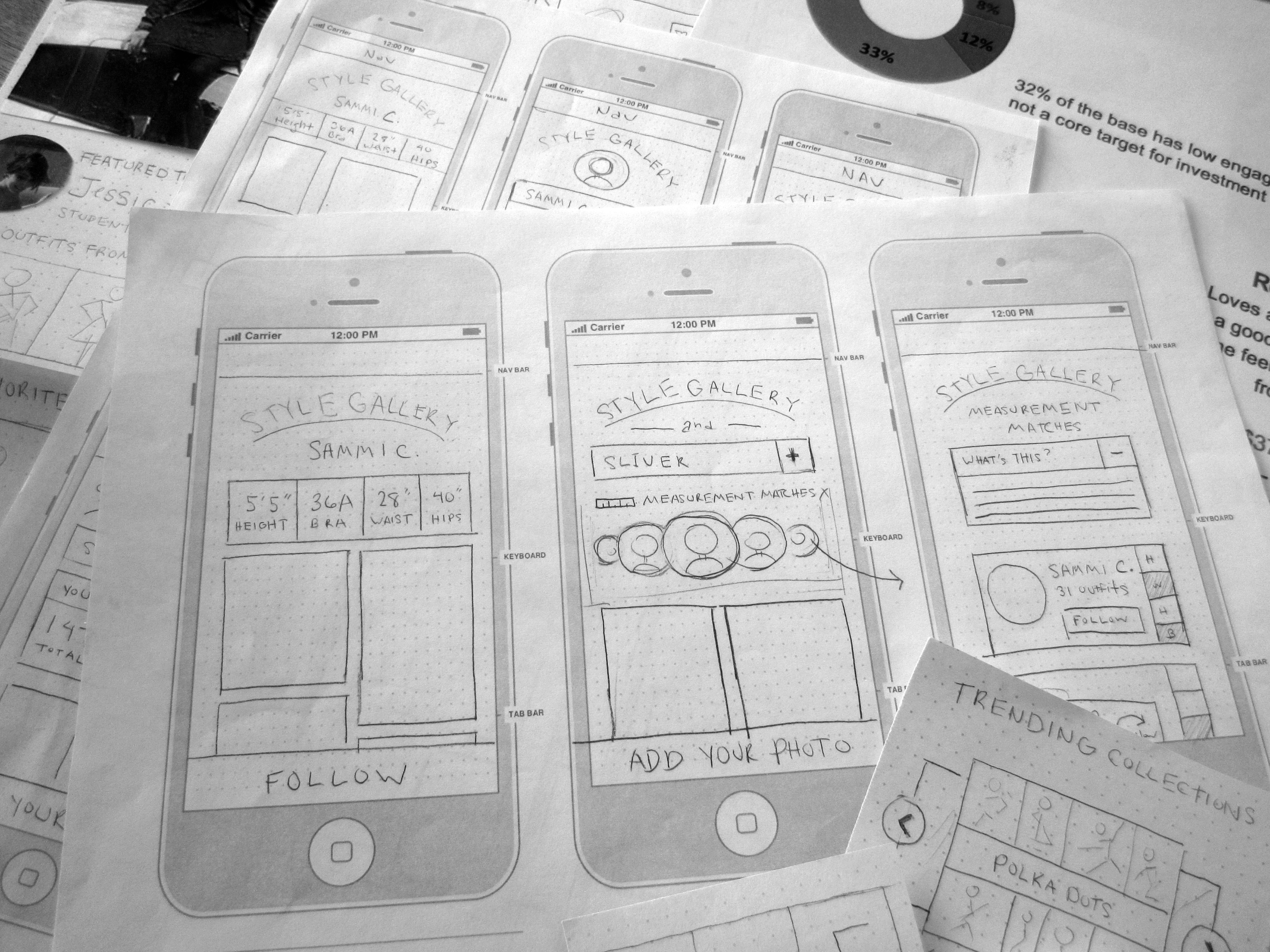
User Profiles have been talked about since I joined ModCloth 4 years ago. I focused on the theme of identity back in April 2012 in parallel with the outfit photos discovery work creating some initial lo-fidelity sketches, wireframes and prototypes. We tested a desktop version of the profile with customers who responded with “When can I have one?”. There was a lot of positive feedback on profiles but ultimately we needed to put the profiles work on pause to focus and launch Style Gallery.
Kickoff
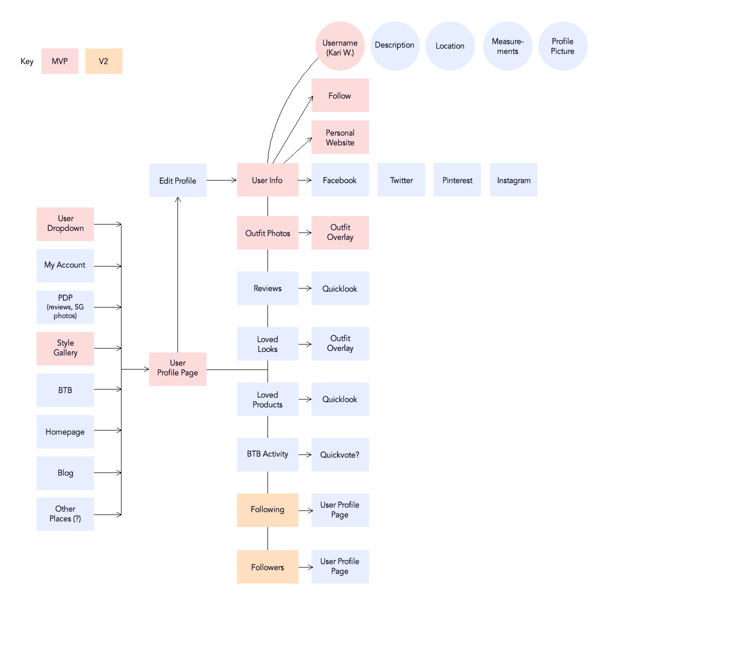
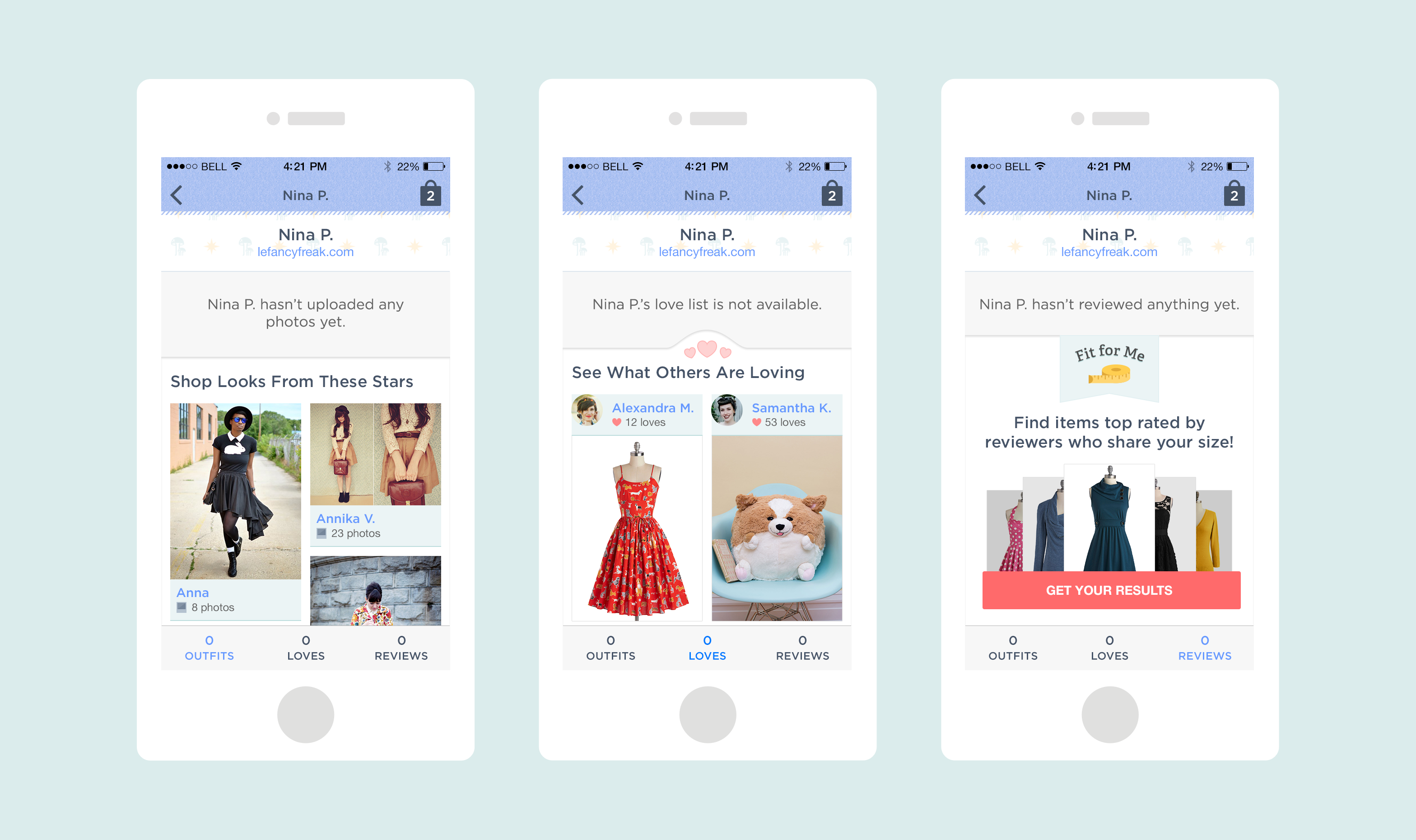
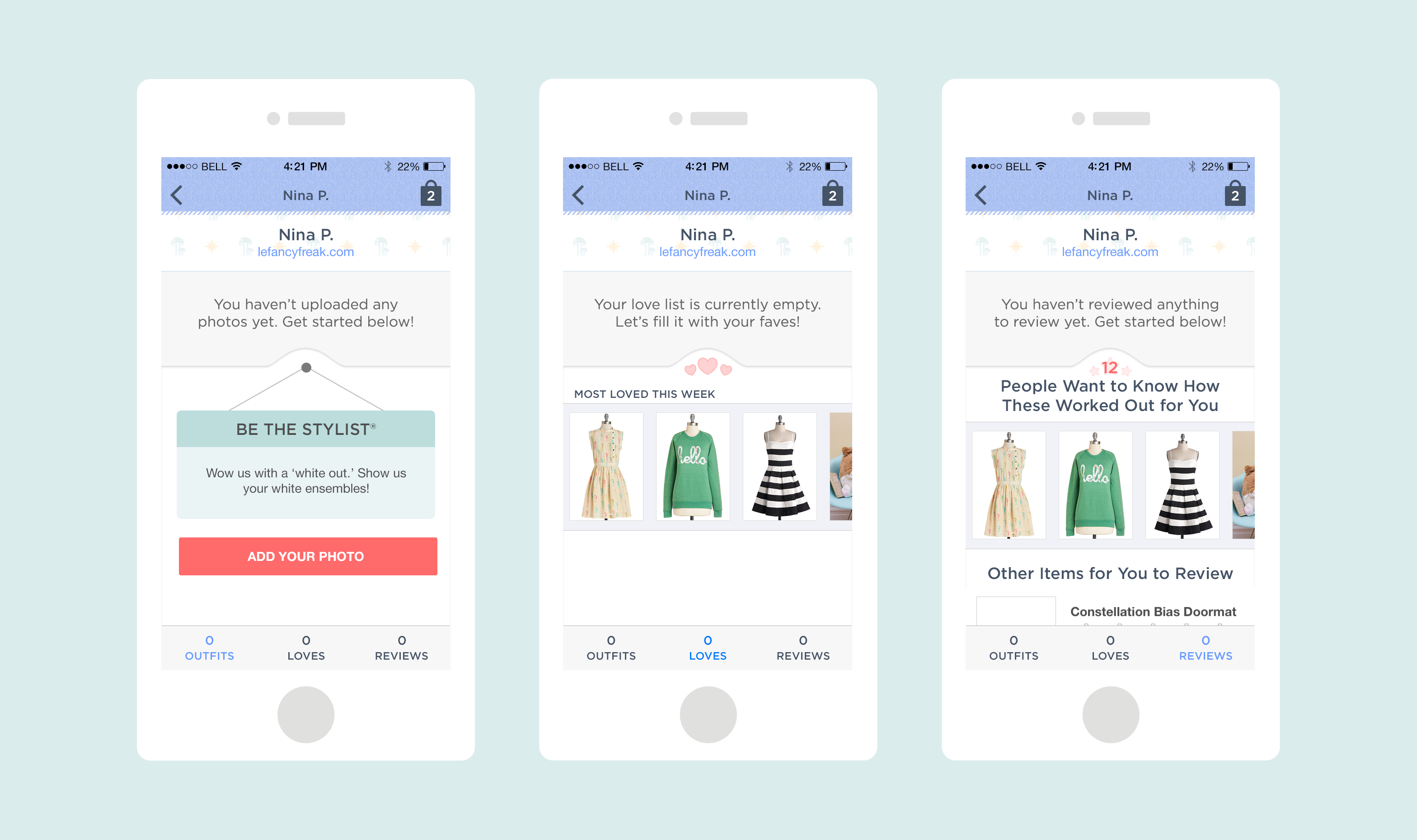
At ModCloth, we’ve been able to use our native apps as a place to test out ideas with a very engaged customer base. Fit For Me for example, is a feature that lives exclusively in our native app platforms (both iOS and Android) which allows customers to find top rated items from people who have similar body measurements. This social feature allows customers to find potentially great-fitting product, but what if they found a person that shared their measurements who had reviewed other items. The team recognized there was an opportunity to try out a very basic user profile much faster in our native platforms than on our website. A profile would allow for the community to find and connect with other members as well as discover product in a different way.
Discovery
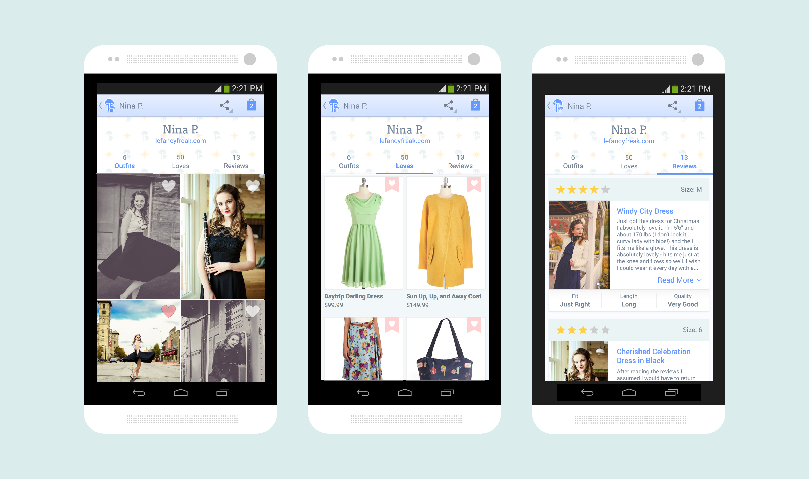
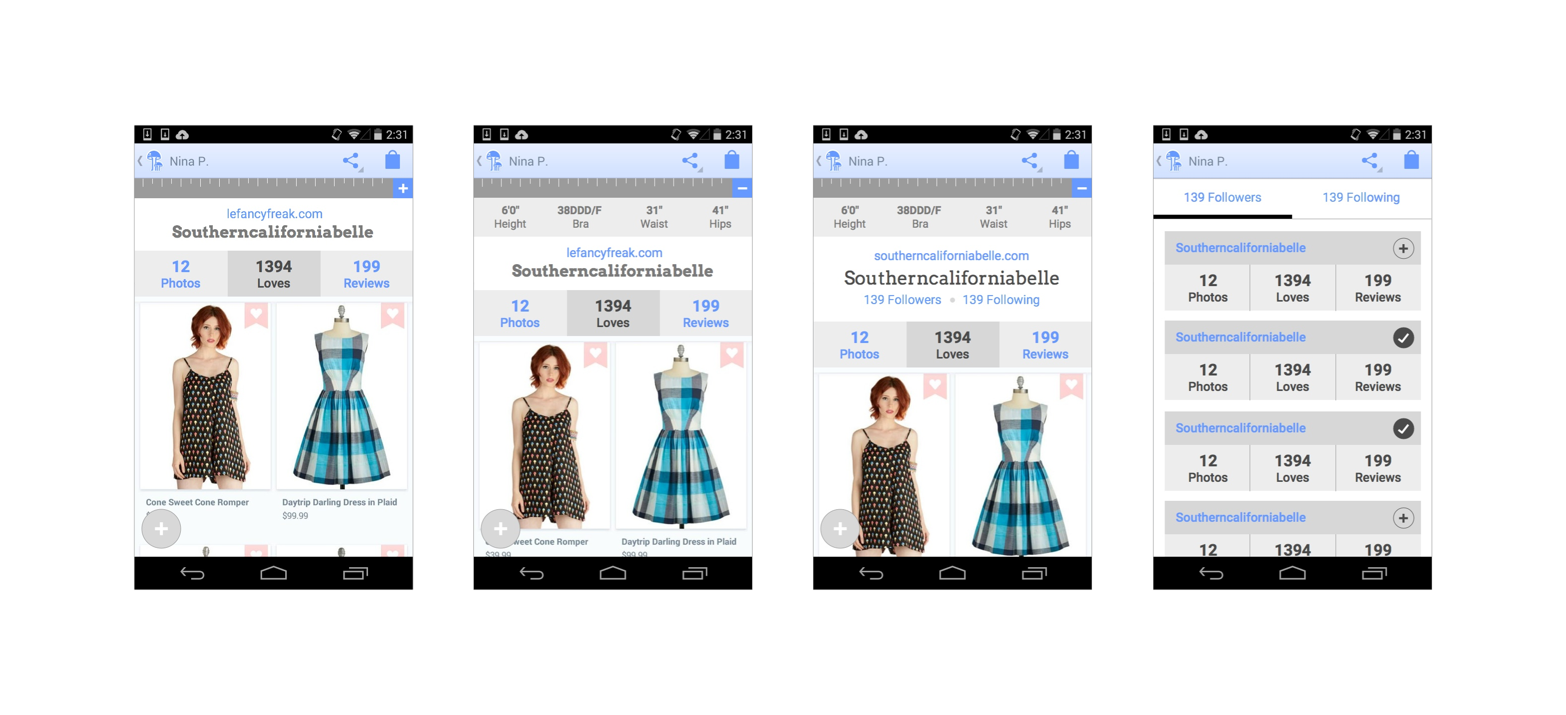
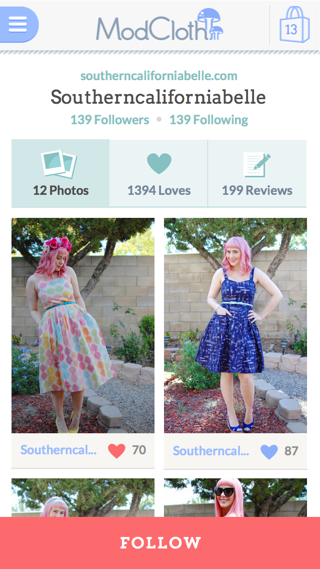
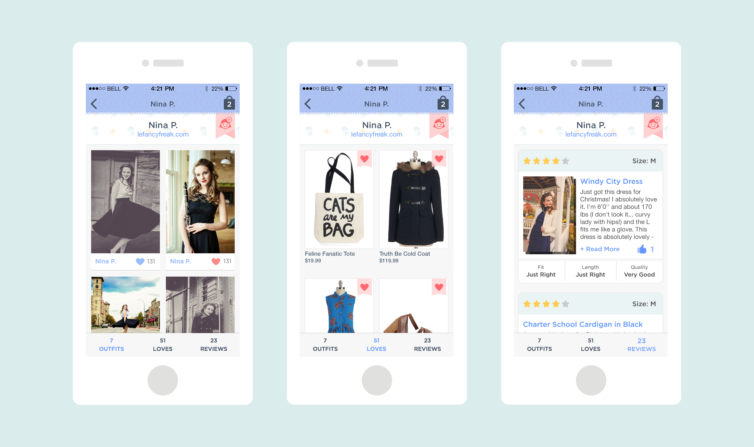
While there is a lot of content about each user that we could showcase in a profile, we decided to start by surfacing 3 content types: outfit photos, loved items, and product reviews. This content was currently discoverable in the app experience so it felt like a logical place to start. Having done prior discovery work on profiles in the past, we did some brief research with customers as a gut check measure. One of our spiffy iOS engineers whipped together a live data prototype of a profile in a very short amount of time which meant I had a lot of work to do on the design side! Key areas of focus for me were working out how to access a profile, what happens when a user hasn’t contributed content, and redesigning how customer reviews are displayed and how they scale depending on where its viewed. I worked through these use cases pretty rapidly initially focusing on Android. Our talented visual designer took on the visual design for this project which freed me up to revisit the iOS considerations.
Launch!
While work on our MVP was underway, our Android engineers were ready to start building. With visual design in the works, the engineers were able to start working on the functionality and work out any issues that arose. One benefit to launching to Android first was access to our beta testers and getting their feedback before launching to our other platforms. We pushed out several releases to the beta group and were able to improve the experience based on feedback we received. We launched to all of Android in September 2014 and were able to start implementation on iOS soon after that.
Post-Launch
Sadly we weren’t able to launch on iOS despite being like 90% there. After launching the 1st iteration of user profiles on Android I parted ways with ModCloth and all work on new feature development stopped.
Learnings
- Supporting 3 engineering teams is tough. We were short on design resources and working as fast as possible. Thankfully we had very patient, self-sufficient engineers that could get started with very rough deliverables or a brief conversation!
- Just ship it! There had been a lot of conversation in the company about profiles leading up to this launch. It was great to work as a team to figure out what was easiest to start with and get it to customers.

Objective
ModCloth has an amazing, devoted, adorable community that already engages with our brand in a variety of ways. At the time of this project, our customers were connecting with us on our social networks (Facebook, Twitter, Instagram, Flickr) and by providing product reviews. We wanted to take this a bit further and evolve our experience to include a social shopping component that addressed our customer’s needs. Our goal was to figure out what a social, community-driven experience could mean for ModCloth which at this point, was very broad.
Initial Exploration
In December 2011, myself and a fellow UX designer spent a few weeks (and a couple long nights) dedicated to creating a visiontype that conveyed a conceptual high-level framework to leverage the power of the community at ModCloth. This was never intended to be a spec we would work off of but meant to show some possibilities. Check it out here. After the dust settled, and the visiontype was presented to our board members, I got back to working on our registration flow until we were able to pick it back up again in April 2012.
Kickoff
The core team consisted of myself (lead designer), a product manager, and a lead engineer (who was more of a consultant at this stage in the project). This core group was part of a larger cross functional team that was wrapping up another project so we had a bit of a head start on the design side. Considering the visiontype was essentially a prototype we decided to put it front of customers to understand what content could be most valuable and potentially give us a signal on where we could start. Overall, users responded very positively to the visiontype and our big takeaways were that outfit photos and finding “others like me” were useful when making purchase decisions.
"I love being able to see different pieces on real people with different body types" - Anna S.
Discovery
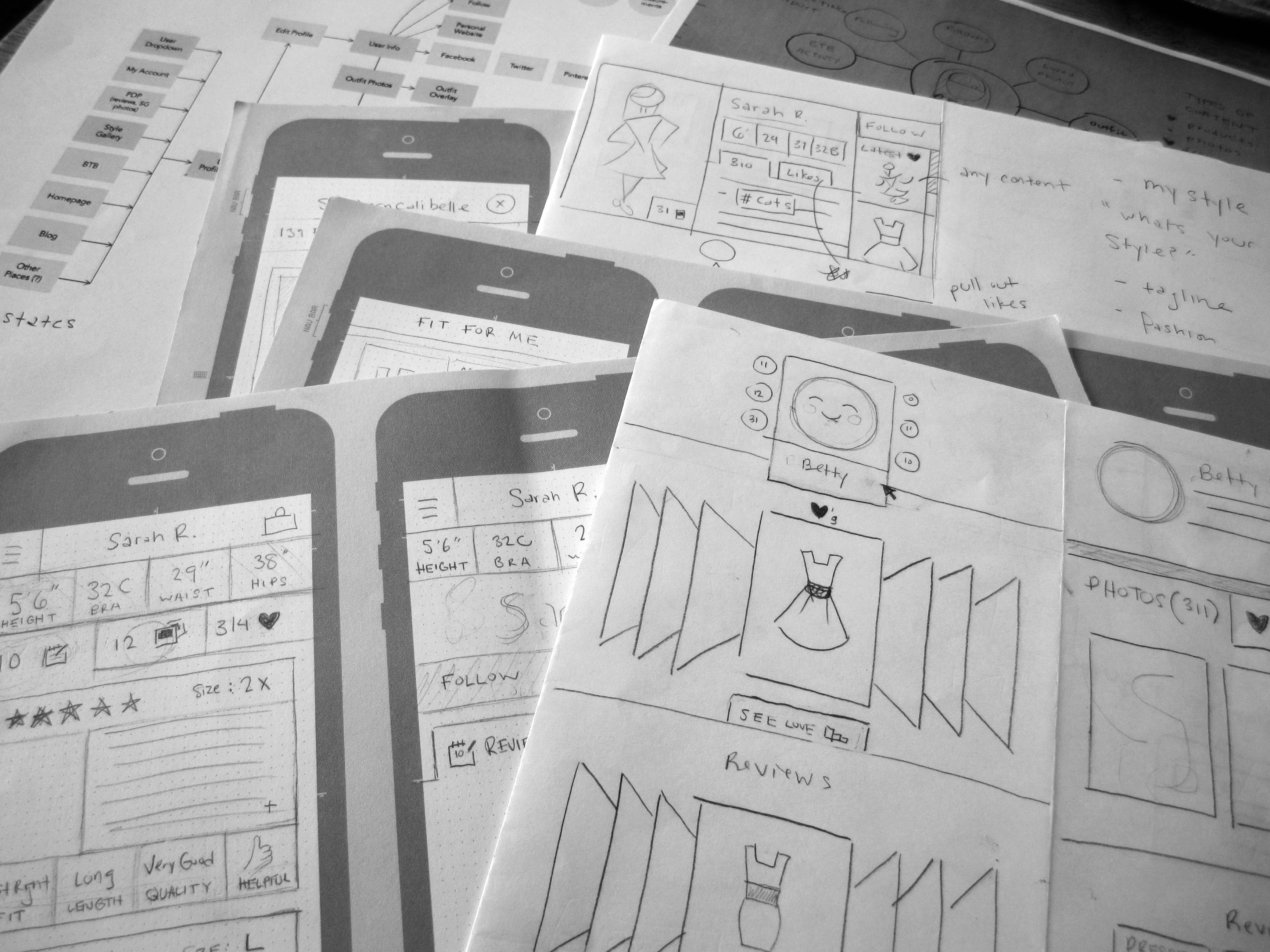
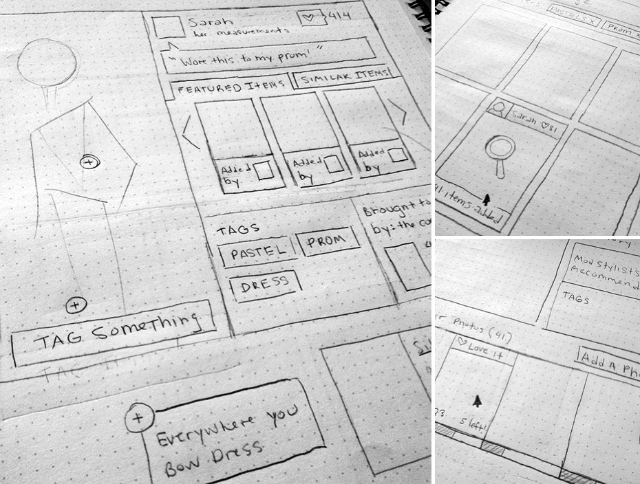
The customer needs we wanted to address were “I need outfit inspiration & style advice” and “I want to connect with people like me”. The team went through several brainstorming exercises with a variety of people to generate ideas. I was tasked with synthesizing these ideas into sketches, wireframes and prototypes to test with our customers as well as to share with stakeholders. Two key concepts emerged from this: an outfit photo experience and a profile experience. We knew that outfit photos could be a good area of focus because our customers already upload outfit photos to our Flickr group and this content fulfilled the desire to see product on real people. Ultimately we thought these concepts could increase opportunities for product discovery, inspiration and connections between users.
While working through designs for the outfit photo experience, I was very conscious of how users would experience this both on their desktop computers as well as mobile devices. With a huge lift in our traffic coming from mobile, it was important to consider all new product development through this lens.
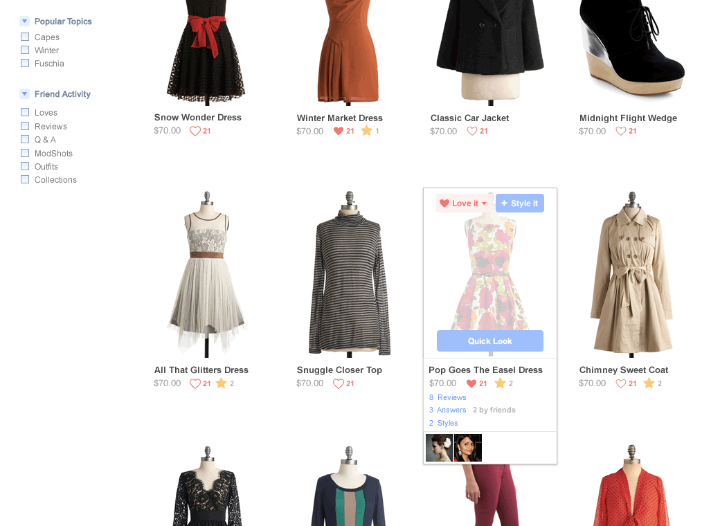
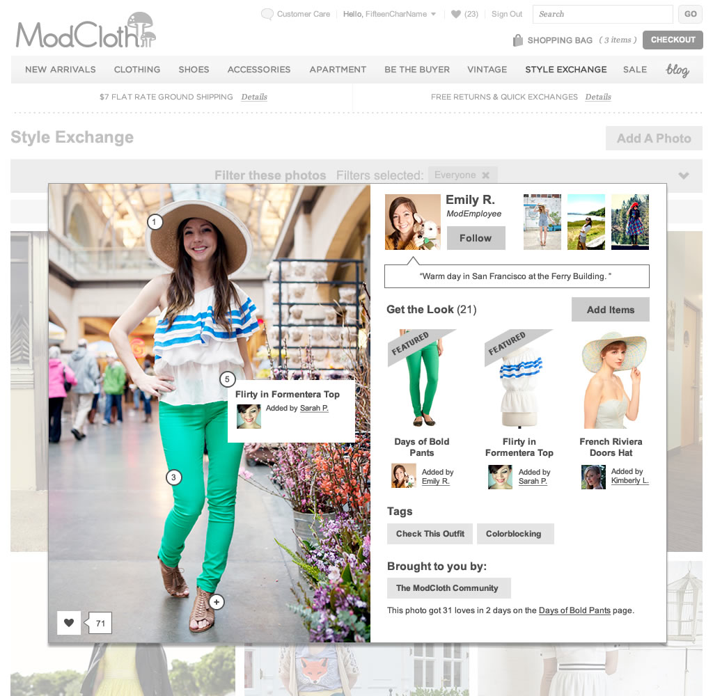
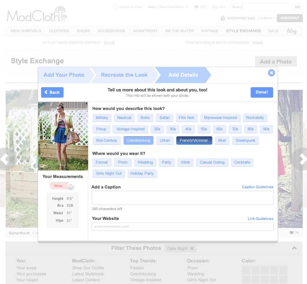
Key parts of the experience included a photo gallery which after talking with engineers felt like a good candidate to build responsively. Along with this was an outfit detail view which would showcase the outfit photo with other info about the contributor, the items she was wearing or had tagged to the look, and other relevant data like tags to pivot to other related looks. As we refined the strategy of the experience we decided it would be more inclusive to allow outfit photos regardless of whether they featured ModCloth items. Considering the brand is vintage inspired we imagined a scenario where someone might upload a photo wearing vintage items and would likely be able to find similar items in our product catalog.
Another consideration at this stage in the project was where else outfit photos would live besides the gallery. It was critical to integrate this content into the rest of the site experience to create more exposure and value for our customers. The product detail page felt like an obvious and high impact place to showcase outfit photos along with places like the homepage or even category pages. The more we could weave outfit photos into the rest of the site, the more successful and beneficial it would be to our customers.


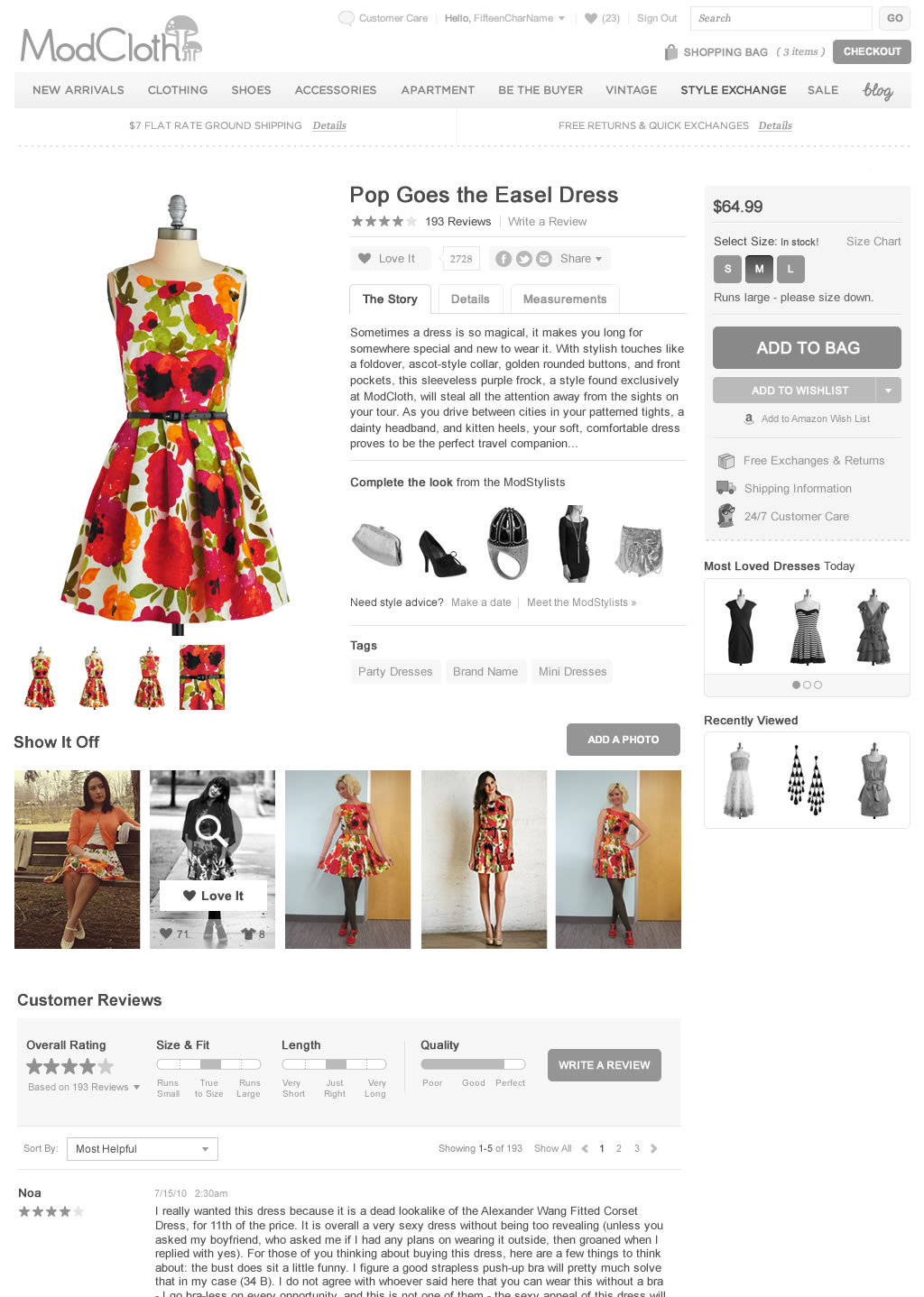
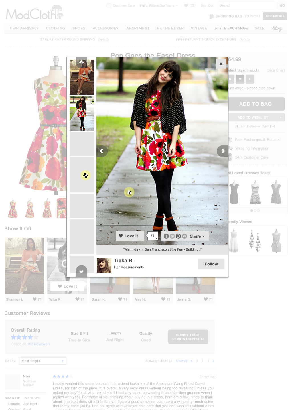
I did a lot of cycles on the outfit detail view and what content we could display each time getting feedback from customers to see if it resonated. One concept I thought would be interesting was the ability for the community to tag items to someone else’s photo. My thinking was this would create an opportunity for those users who might never upload a photo themselves but might recognize an item in a photo immediately. This would be an easy way to participate, get recognition for their contribution and create a more shoppable experience.

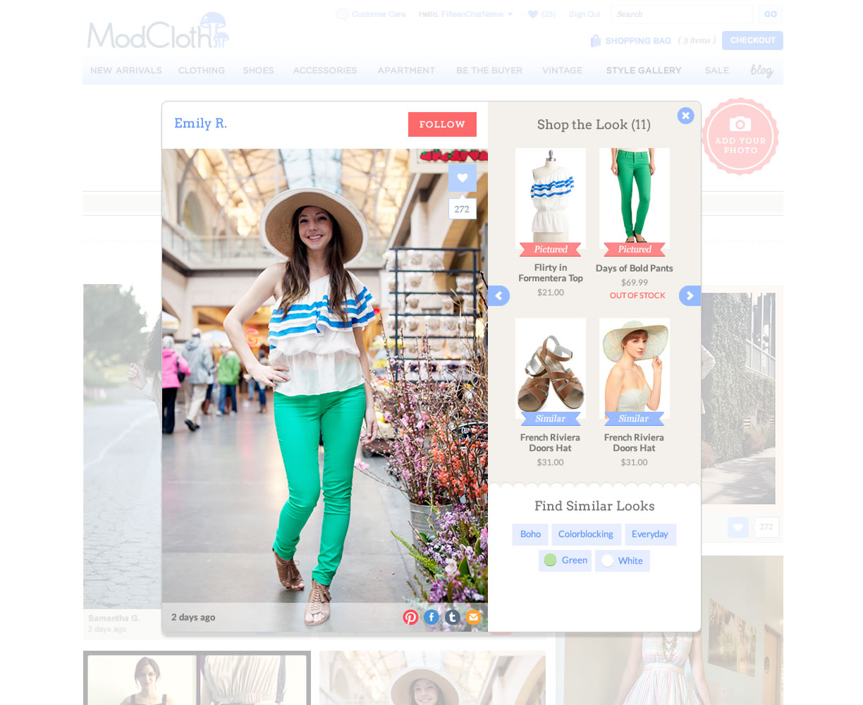
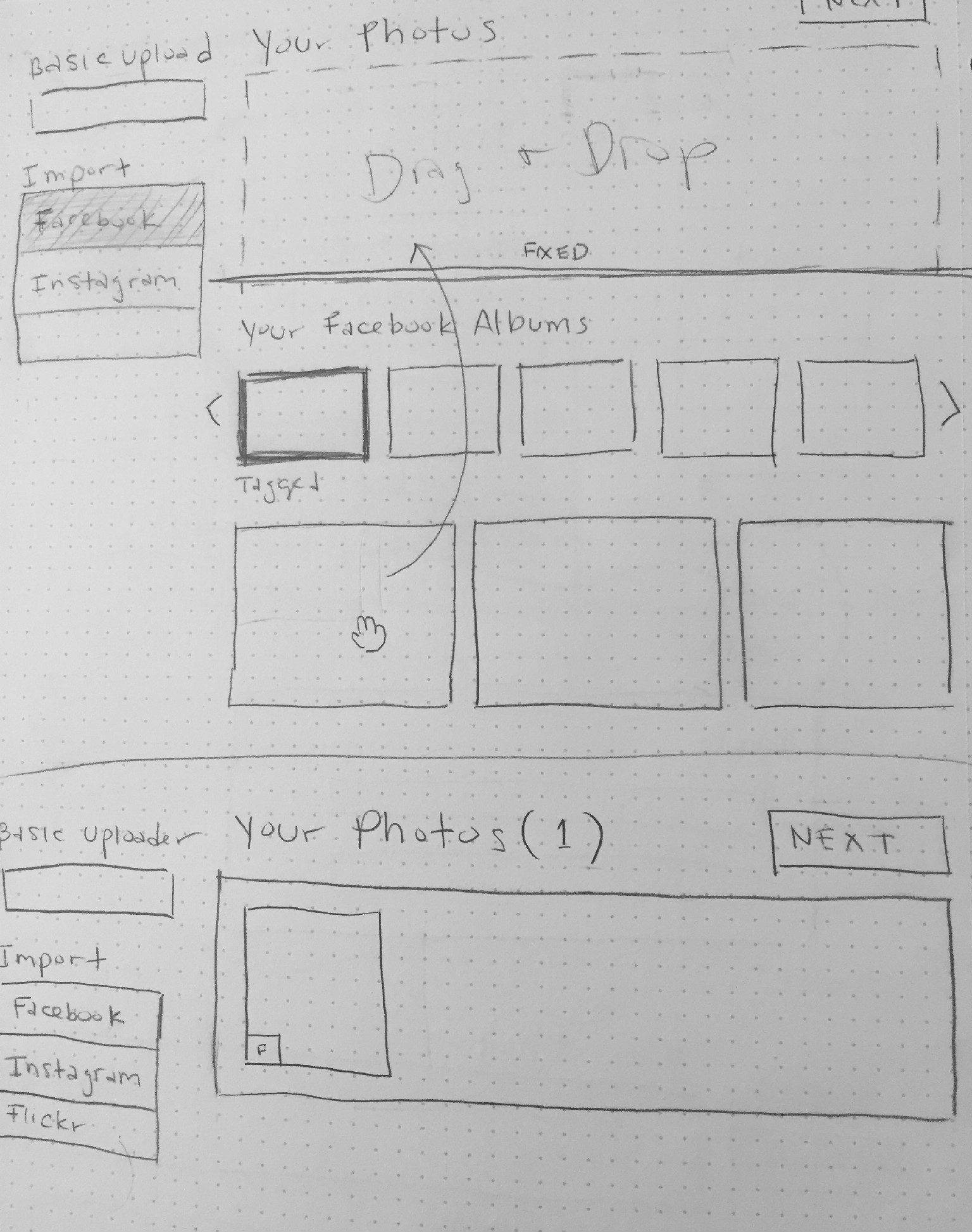
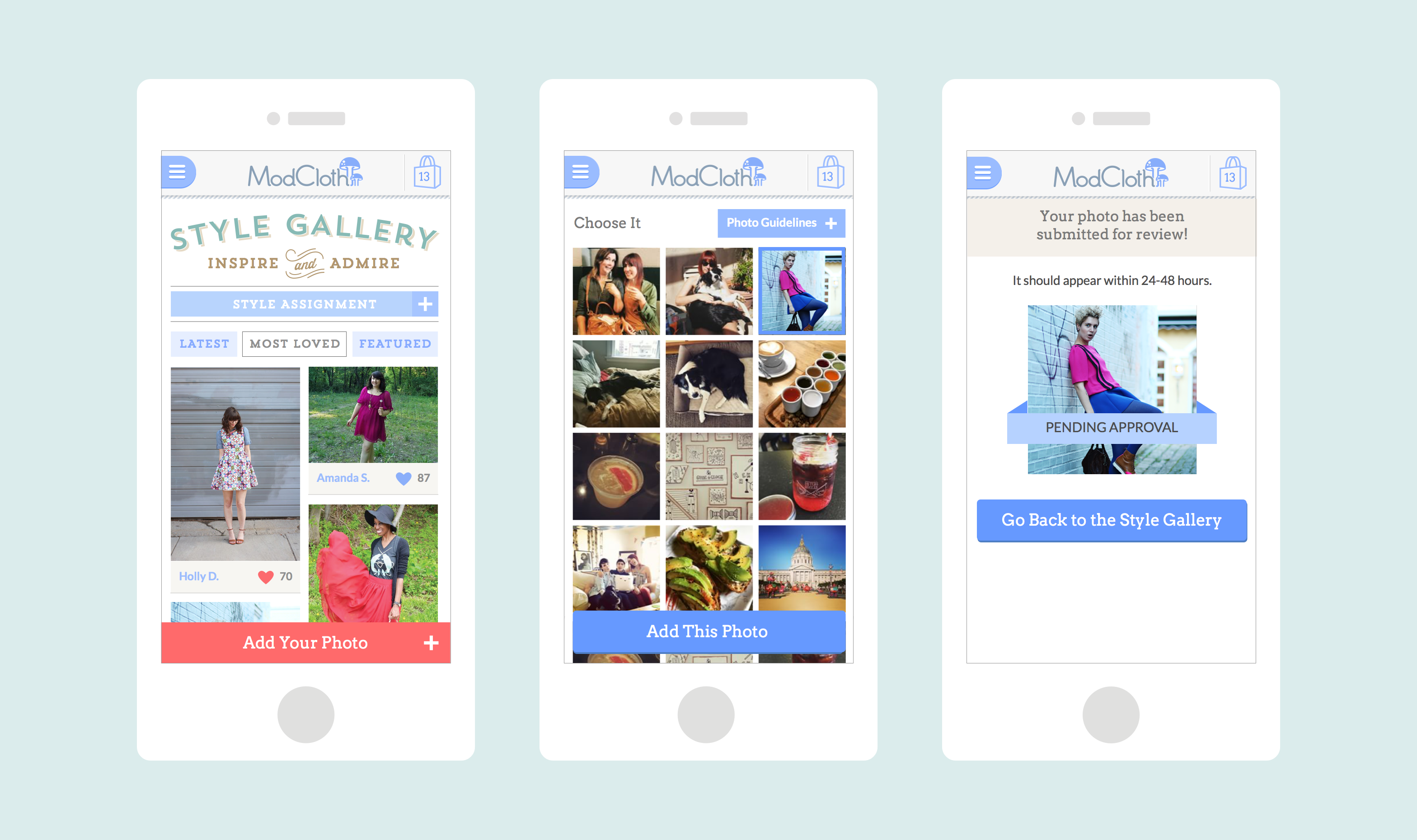
Another important aspect to the Style Gallery was the upload flow. We knew this would be important to the success of the feature and therefore needed to make it dead simple. I designed a mobile and desktop upload flow in parallel but we focused on desktop initially since we thought tagging product was a more complex task and could best leverage the real estate of a larger screen. After some wireframing, I created some prototypes to test with customers and we felt confident in the design.
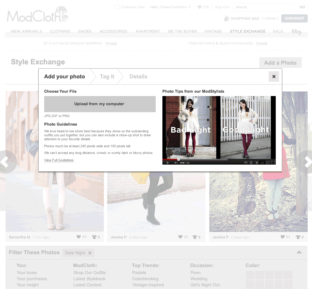
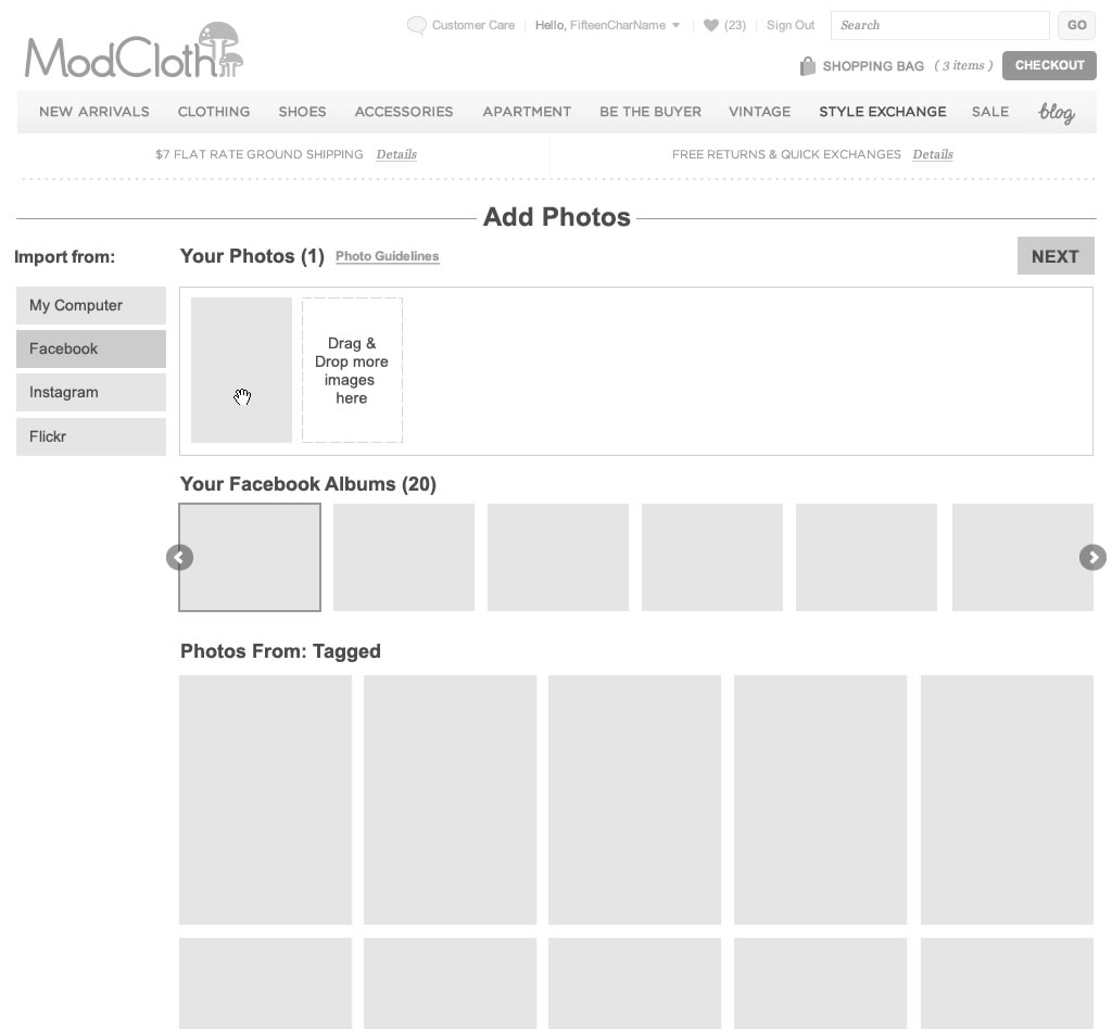
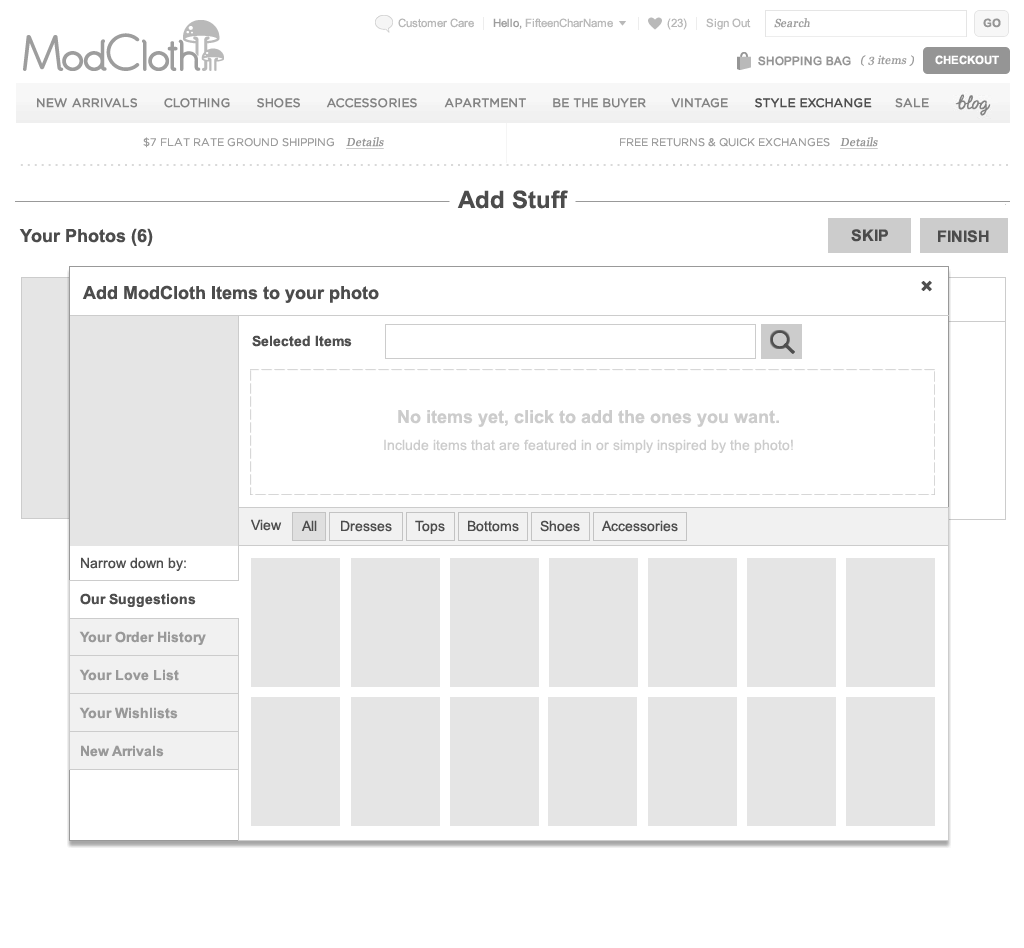
Defining our MVP
With some clarity about what we were creating, a holiday deadline was imposed and we needed to make some choices about what we were going to launch. The user profiles concept was put aside to focus on outfit photos. Our product manager drove the MVP decision-making with input from design, engineering and other key stakeholders. The core experience decided upon consisted of an outfit photo gallery with an overlay view, a basic desktop upload flow with the ability to tag products, and a basic moderation tool. This meant a lot of the fun, unique features that were originally designed in wouldn’t make it into the initial launch.
Launch!
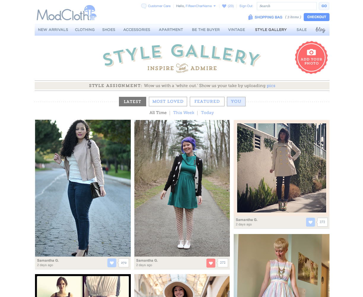
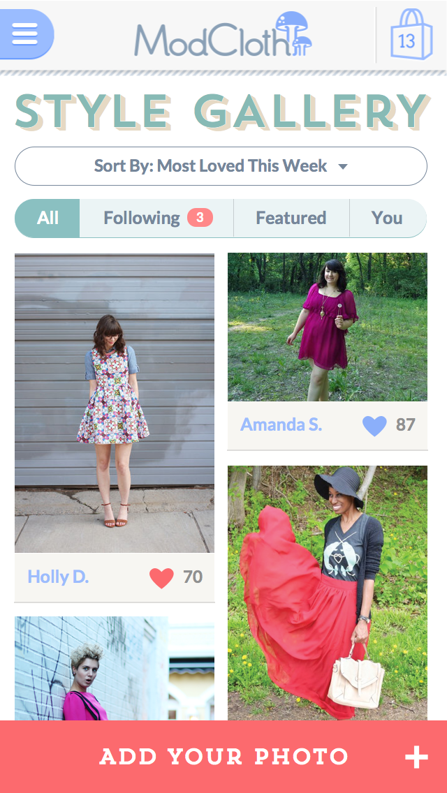
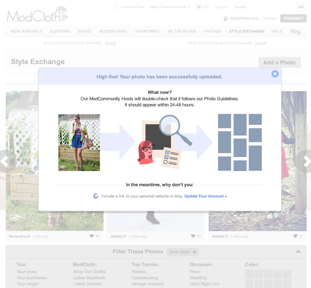
In order to get the MVP out the door the whole team kicked it into high gear! I paired with engineers to knock out interactions and visual design as quickly as possible while others picked off stories at lightning speed. The product manager had come up with a launch strategy that meant we would do a soft launch to a small group of beta users before releasing to a larger audience. After seeing our awesome community of fashion bloggers and fans upload truly inspiring photos, creating a thriving collection of looks we gave our beta version the green light to all users. Before Thanksgiving break, we had successfully launched our 1st iteration the Style Gallery and were getting lots of actionable feedback!
Post-Launch
After launching our MVP version, the team was busy fixing bugs, gathering insights from our customers, and understanding baseline metrics. We quickly followed up with some key features that we knew were essential in making Style Gallery successful. It was a great feeling to be able to optimize what we had built and really understand how it was performing and how we could make it even better. I led the design efforts on the team supporting Style Gallery for the next 2 years.
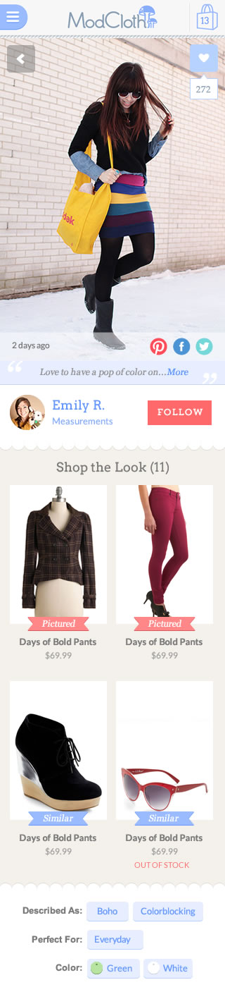
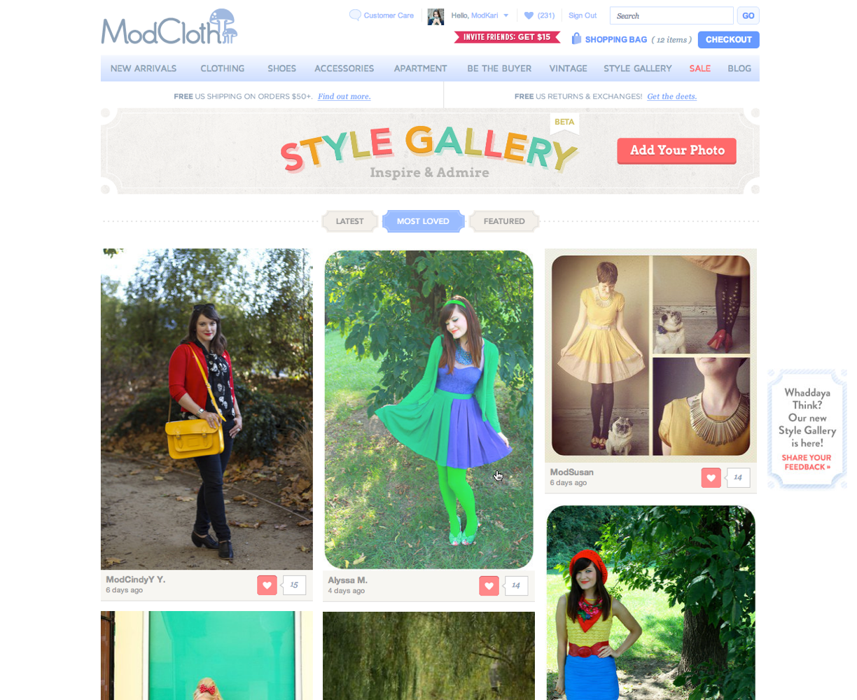
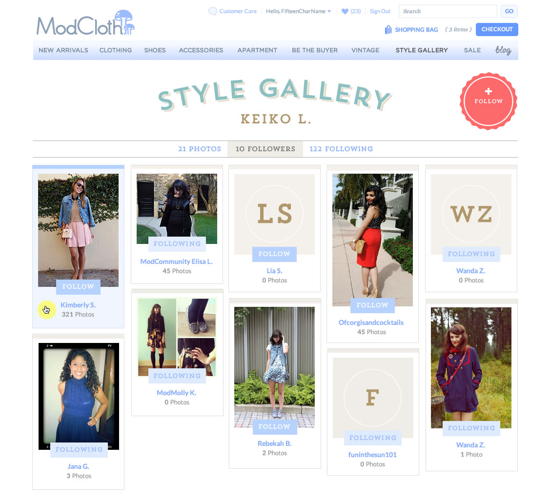
Key iterations post-launch included exposing outfit photos on our product detail page, easy mobile upload tools, collections of outfit photos around a variety of themes, seeing all the photos from one user and following them, and building out Style Gallery in our native apps.
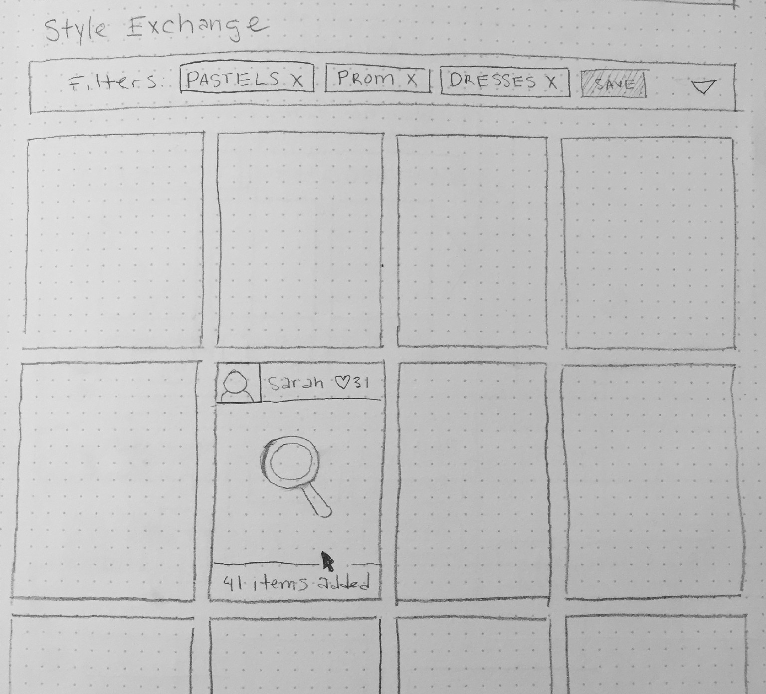
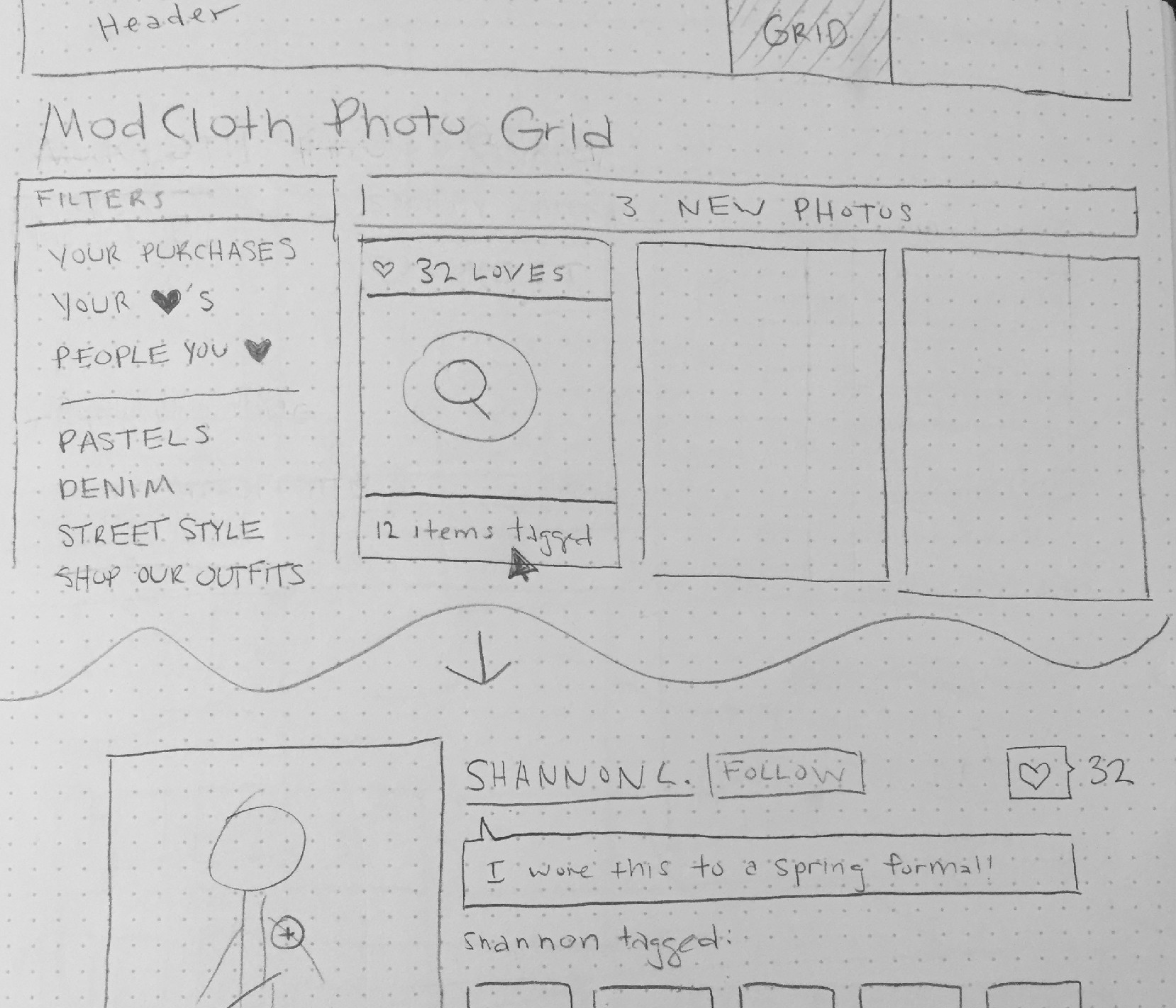
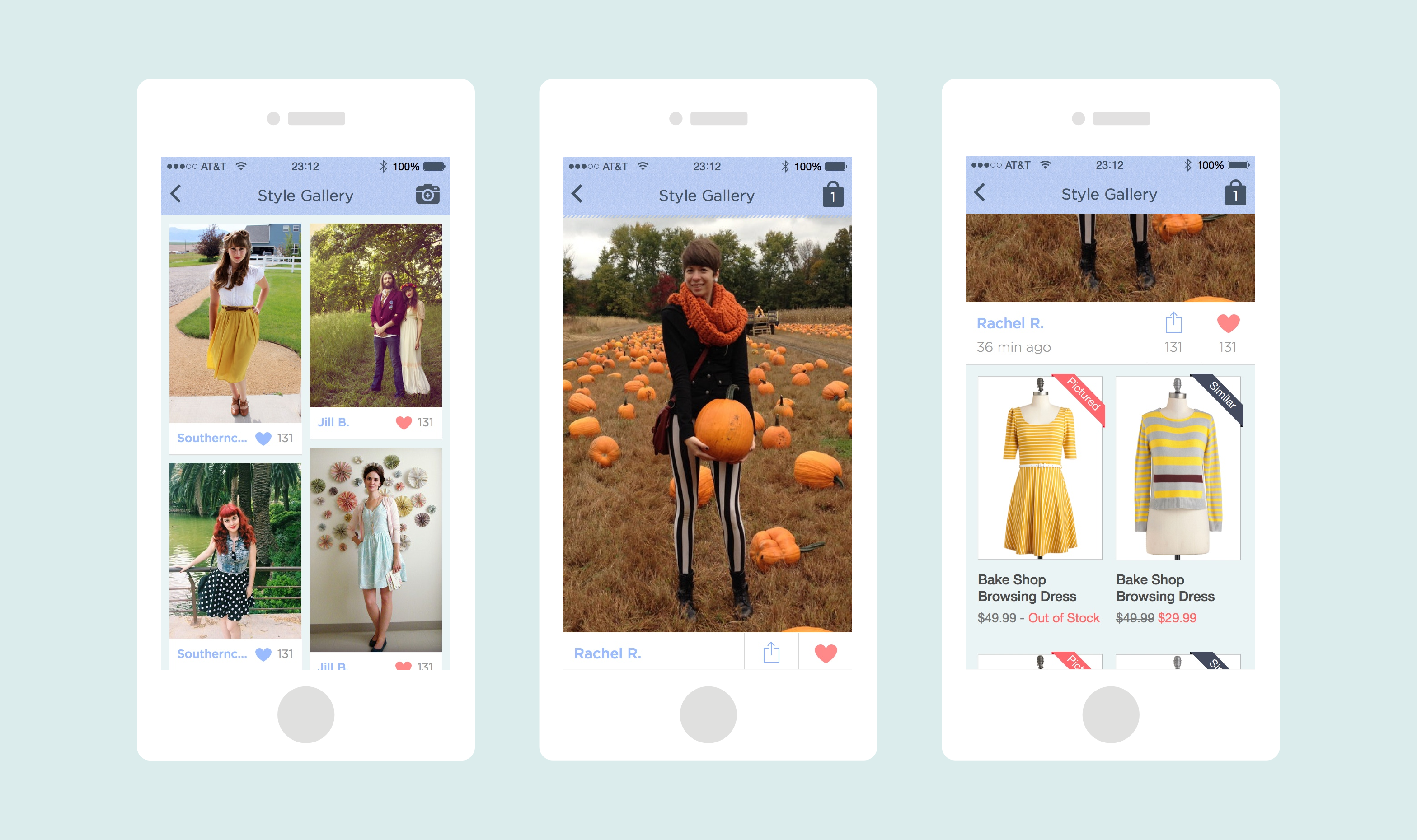
Our team was proud of the fact that we could release as frequently as needed which meant we were pushing out new features multiple times a week. This meant the Style Gallery experience was changing pretty rapidly. As part of a hackathon myself and a fellow engineer whipped up this version of the outfit detail view which we almost launched.
This presentation illustrates our strategy for 2013 and while we didn’t quite achieve all that was mentioned we did a lot to evolve the Style Gallery experience to what it is today.
Learnings
- Defining an MVP is crazy hard. After putting in lots of hours thinking through an entire ecosystem that works together in a seamless way its a challenge to make hard decisions on what is essential for an initial feature set.
- It's a team effort! Everyone has great ideas and its worth the time to get all the ideas out on the table and allow teammates to contribute at each stage of the project. Together we created, launched, and iterated on something I’m very proud of.
- Engage customers as much as possible. Validation is critical in order to understand if a design is meeting customer needs. We made sure we were putting our progress in front of customers throughout the lifecycle of the project from concept to launch to each follow-up iteration.
Live Site
NOVEMBER 2012
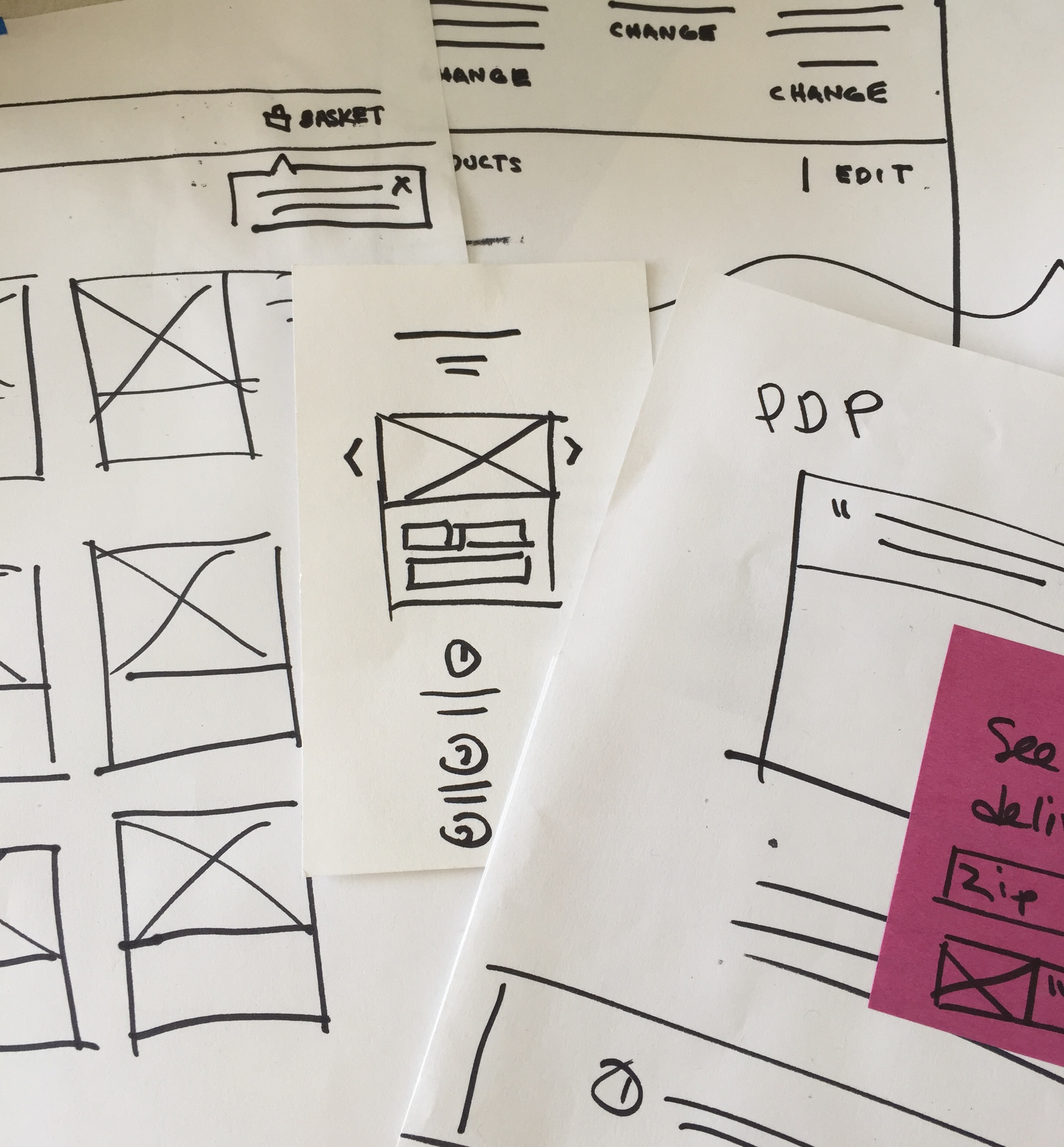
Since Mevio contains audio shows, we needed a way of displaying audio at different dimensions. These versions show how a queue, volume, album art could be displayed visually.